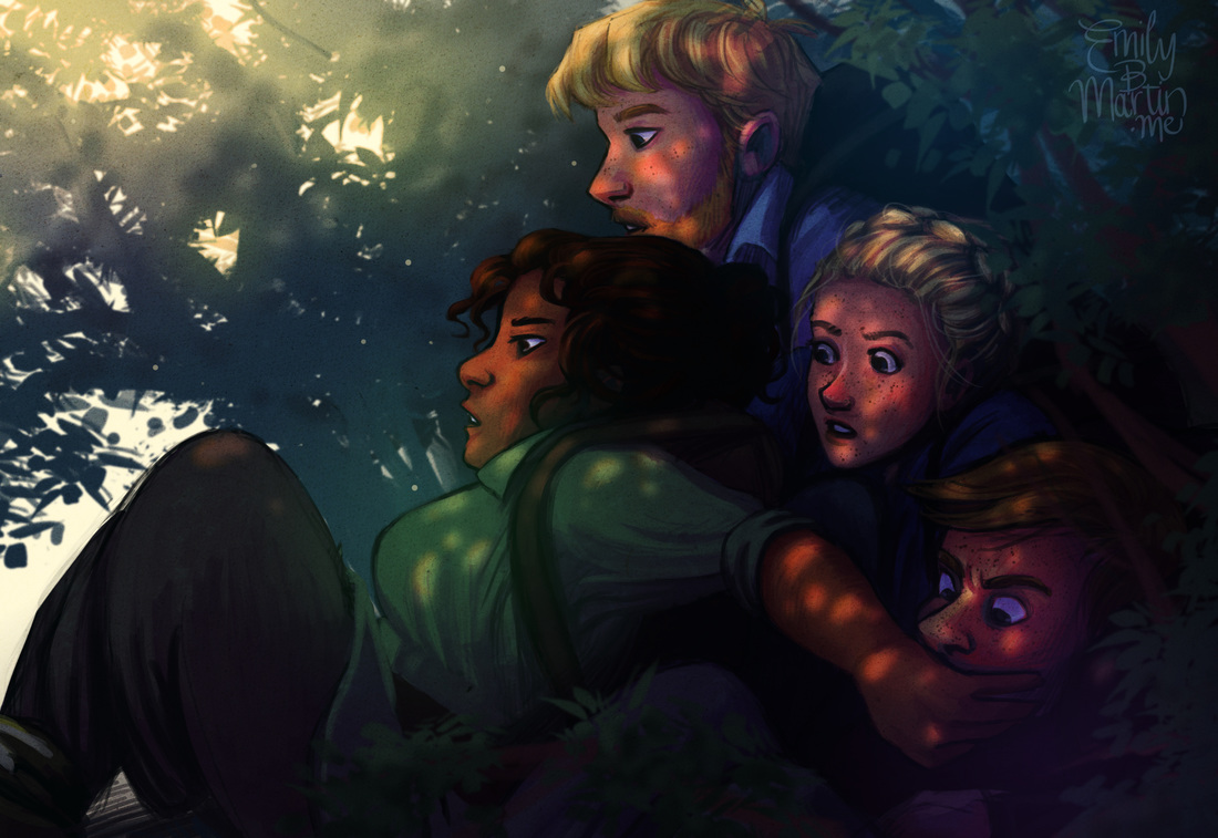
 We had our first truly close call a few days later. We had just scrambled over a bulge of rock ribbing the mountainside, pocketed with patches of moss and fringed with dense azalea thickets. I was correcting my bearing; the siblings were behind me, holding some discussion. I found my landmark and was slipping my compass back into its pouch when the slightest noise filtered up the rock face. Woodwalker releases in 24 days! I am developing a lot of new illustrations for the website, which will go live after the e-book launches on May 17. I wanted to put something up in the meantime, though, so I finished this piece I started a while ago. It quickly became both overworked and lazy (somehow), and no closer to achieving the loose, dynamic style I keep aiming for, but here it is nonetheless.
1 Comment
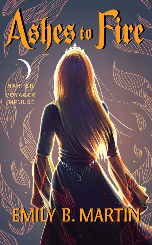
It's here! In just the past few weeks, Woodwalker has gone from a word document still undergoing edits to a finalized product. The final copyedits are done, the text has been formatted, and the thing has a COVER! 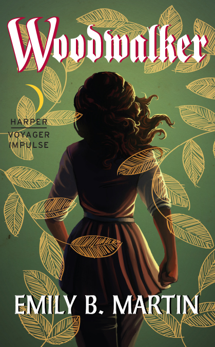 Let’s be honest—people judge books by their covers. We can’t help it. A good cover draws us in, piques our curiosity. A bad cover makes us pass it over for something else. It’s a critical part of any book, and one I hoped would turn out right for Woodwalker. Several months ago, when I began telling people that my book had been picked up for publication, the most frequent question I got was, “are you going to do the cover?” At that early stage, I could truthfully say, “I don’t know”—I wasn’t sure how involved I was going to be in the process. And, in a way, I didn’t mind if I wasn’t allowed to work on the cover. Like most artists, I have a delicate relationship with my artwork. I’ll finish a piece with immense satisfaction, sure it’s going to be the crown jewel of my portfolio, only to come back to it a few days later and realize with dismay it’s nothing but the same crap I produce week after week. There’s one storybook I wrote and illustrated for my girls that I try to avoid reading at all costs, because the illustrations nag me so much. In that respect, I didn’t want to illustrate the cover and then have it hanging over me for the rest of my life, knowing at this point next year I might barely be able to look at it. I looked forward to what another artist might dream up for the design. And because it’s such an important part of a book’s appeal, I felt more comfortable leaving it up to industry professionals. One of the first things my editor asked me to do upon signing our contract was put together a Pinterest board of book covers I liked, so the art department could have some starting points (you can find that board here, if you’re interested). I did some research and a whole lot of pinning, and I realized I was drawn to artistic covers with stylized elements, rather than photos or ultra-bold graphic designs. Here were some of my favorites:  I loved the cover for WE, THE DROWNED so much, I placed a hold on it at our library without even really knowing what the book is about (boats and drowning?). That's what a good cover does. But then, me being me, I couldn’t just leave it at that. I sketched up a few drafts of what Woodwalker might look like with some of these elements. 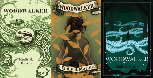 My mom said my version of WE, THE DROWNED looked like an octopus, though. I sent the pin board and my sketches to my editor and the art director, thinking they would either take my designs and run with them, or they’d discard them for something else. I wasn’t too beat up about it. The only thing I knew for sure I wanted to avoid was a Photoshopped image of a white girl in a prom dress staring into space. 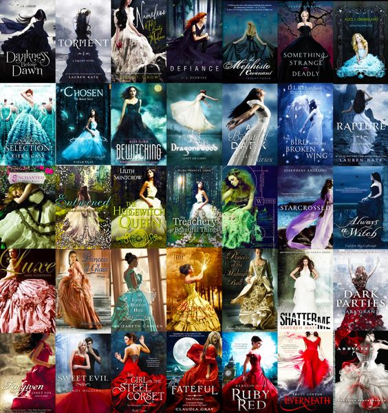 Exhibit A To my surprise, they sent me back one of my sketches and said they’d like to see another draft. It was the cover inspired by The Visionist and featured a shot of Mae marching away from the reader, overlaid with a foliage design. Their suggestions were altering the colors to make Mae stand out a little more, and to be sure she came across as a woman by changing her hair and clothes. So I got back to work. 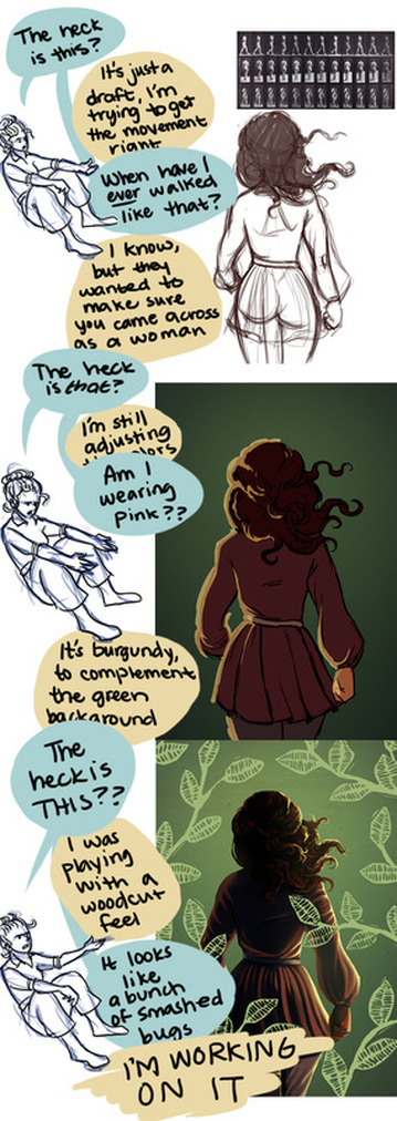 When I illustrate Mae, I almost always put her in green or brown and put her hair up in a knot (she hates having it loose). But I made myself stretch her design a bit to meet the recommendations of my art director (if there’s one thing I’m learning about writing, editing, and publishing, it’s that industry professionals are usually right). After a little more back and forth, we ended up with this draft: 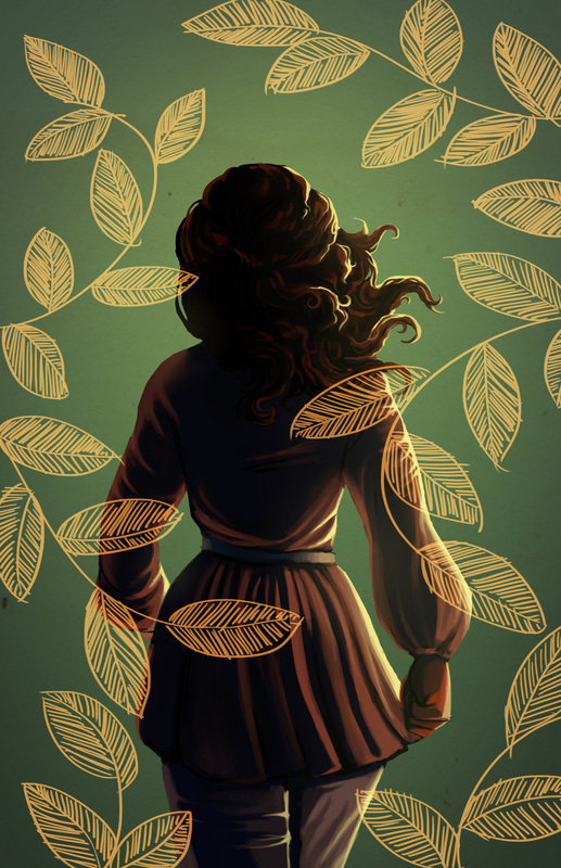 My art director emailed me back saying it was great and he would take it from there in terms of adding the text and other elements to the front and back covers. Several weeks later, I received two drafts from my editor with the title and additional elements added. 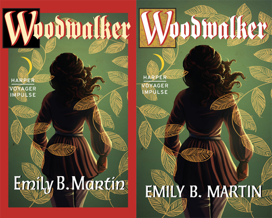 I have to say, I was caught off guard at first. Cherry red accent color? Heavy, gothic font? On a book about an unpretentious treehugger and her Lothlorien-meets-Appalachian homeland? It was... not entirely what I had expected. It felt a little out of date to me, like it belonged in between my ‘90s copy of The Lost World and my ‘70s copy of The Hobbit. 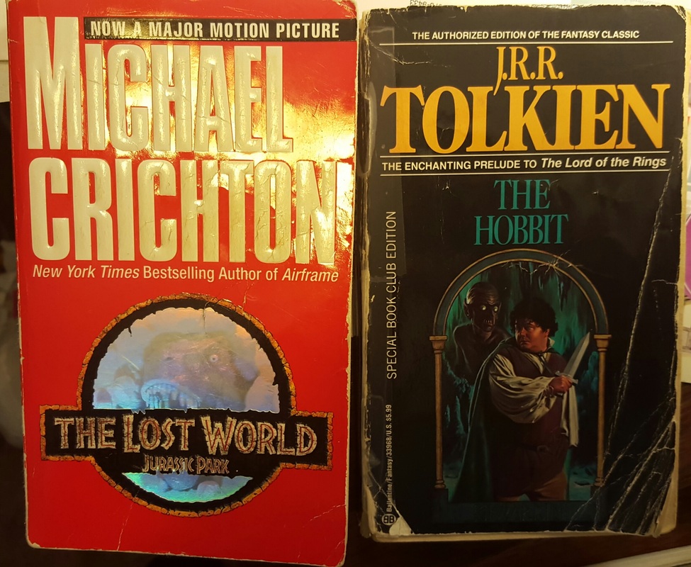 *electric guitar riff* But I made myself wait, live with them for a day—like I said, industry professionals are usually right about things like this. By the next day, I had decided I could maybe live with the second, but it hurt me a little inside. It just didn’t have the organic, artistic feel I wanted, and it wasn’t something that would capture my interest in a bookstore. But I also didn’t want to be needy or demanding or, worst of all, make a decision that would negatively impact my book. Compounding my angst was my own experience on the artist’s end of these types of projects. I’ve had clients who commission a design or illustration, only to hate whatever I come up with and request changes that I think are detrimental to the design—ultra-detailed logos that don’t read at a small size, abysmal color choices, fonts that induce vertigo. I’ve reworked products to create something much less visually appealing and usually try to scour them from my portfolio afterwards. I didn’t want to do anything like that here—project my own preferences onto the book cover to the point of negating the expertise of my editor. At the eleventh hour, I also realized another thing that was bothering me—Mae didn’t look like Mae. This was my own fault—in trying to make sure Mae read as a woman, I somehow lost some of her character. At the time, I think I dismissed this as me being too closely tied to my own character design—what cover ever really manages to capture the protagonist? I have three different cover suites on my copies of Megan Whalen Turner’s Queen’s Thief series—one makes Gen look like a Mediterranean twenty-something, one makes him look like my dad, and one makes him look like a white twelve-year old. None of them impacted my enjoyment of the books. No big deal, I thought. But ack, now it was a big deal, especially with the uneasiness I felt with the rest of the design. Hastily I pulled up my original illustration and began reworking some of it (by this point I was losing sleep and the patience of my husband). I took away Mae’s billowy sleeves and replaced them with a design I often use when drawing her—a separate shirt under her tunic, with the sleeves rolled up. I felt much happier with that look—to me it conveyed a sense of readiness and action. This was also well after midnight, so I was probably approaching delirium anyway. 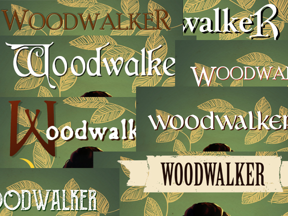 So much delirium. At the advice of my agent (and my husband, who was getting irritated with my drama), I told my editor the cover designs didn’t feel quite right to me, and I asked if we could do a few variations with other fonts and colors. I sent him the revised illustration and some examples of other books I liked. After some back-and-forth, he sent me an updated set with some different variations. While the font and red drop shadow didn’t change, other elements did, and ultimately they felt a lot better to me than before. 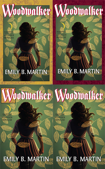 After another day of waffling and polling my agent, beta readers, and daughters (“Which one do you like?” “Oh, a moon!”), I settled on the fourth one. I was drawn to the simple design, and the title font didn’t feel quite so out of place to me. And so we have the final product.  The good thing about revising the illustration at the last minute is that it resolved some of my original fears—that a few months down the line, there would be things I couldn’t stand about it. In the months since I first drafted it, I’ve learned a lot about bounce light and color balance, and I was able to improve some of that with the revision. Lesson learned—I’m going to illustrate the cover for the second book now, so I can revisit it in a few months and make it better.
Ultimately, I’m happy with how it turned out, and in the end, I’m so, so thankful I got to do the illustration myself. I’m grateful to my editor and the art department for working with me, and to everyone who gave me feedback during the process. I’ve had time to get to know the font and color and make friends with them. I love Mae’s purposeful forward march, which I think communicates her confidence and drive. I think the leaf overlay lends an eye-catching graphic feel that will be recognizable on the shelf or as an online thumbnail. And the design lends itself well to the rest of the trilogy—each book can have its own variation, making it nice and cohesive. So! That’s that. Woodwalker has a cover. It has a title page, a dedication, acknowledgements. It has a summary on retailer websites and a variety of genre categories. It has a publication date. All it needs now are readers. 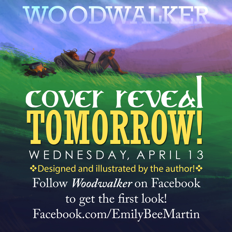 Even when trying to make my art better reflect the epic fantasy feel of Woodwalker, it still ends up looking like middle-grade unicorn giggles. If anybody has Alan Lee's phone number, tell him we need to talk.
I also don't think Mae would actually have books with her, since she has to carry her whole life on her back. Maybe she uses the pages she's read as firestarters. (Literary professionals screaming in the distance.) I realized I’ve been a little misleading about Woodwalker. This occurred to me after about the tenth person asked when they could buy the book for their child. I’ve also been asked if my illustrations will be in the e-book version, and in a recent article I was referred to as a “children’s author.” This is totally understandable, based on my frequent posting of scene illustrations and inane cartoons (though I admit it’s hard to look past the book blurb available on all retailer websites, which includes the word damn and multiple references to execution). So I’m here to set the record straight: Woodwalker isn’t a children’s book. 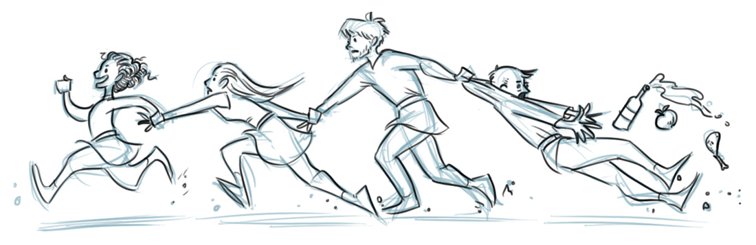 What, this doesn’t scream “mature audience” to you? It’s not graphic or even terribly violent, but it’s not really aimed at readers younger than high school or so. HarperCollins has placed Woodwalker in the “epic fantasy” category, which I have trouble with—epic fantasy to me means dragons and sorcery and probably talking plant life. But really, it’s just a way of saying “adult fantasy” without sounding questionably erotic (no sex in this book—it’s going to take several more novels before I get comfortable writing that kind of thing in something my in-laws will probably read). Another classification HarperCollins has given Woodwalker is “Coming of Age”—I have issues with this, too. I can’t speak for my editor or publicist, but the audience I envision for Woodwalker are twenty-something readers who are looking for stories similar to their Young Adult favorites (like Tamora Pierce’s heroine novels), but starring characters closer to their own age and life stage. This audience is often referred to as “New Adult,” though that categorization usually means steamy romance novels (again with the eroticism). The reason I have trouble with the “Coming of Age” classification is because Mae isn’t struggling to master a skillset or figure out who she is. She knows her strengths and her role, and she uses them to meet the challenges she’s presented with. 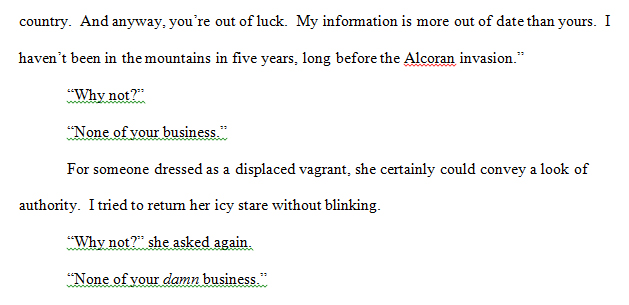 75% of which involve snappish comebacks. There aren’t any illustrations in the book. I drew the cover, which will debut this coming Wednesday, and I drew the map inside that shows the protagonists’ journey. But that’s it. Everything I post—all the paintings and sketches and goofy comics—those are partially for my own enjoyment and partially because that’s how I organize my thoughts. The best example of this is my old Keepers of the Orb blog, which some of you probably remember, where I drew comics of my adventures in parenting. I stopped posting on that blog right around the time I started querying agents for Woodwalker, because I didn’t have time to do both. But the point remains—drawing is how I make sense of the world. 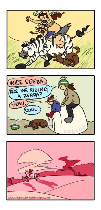 Pictured: Making sense. Sketching and illustrating has also played a big part in planning and writing this novel and its companions. In fact, once I started writing Woodwalker, my art production literally tripled—prior to writing it, I was filling up maybe one sketchbook every year and a half. But since starting the story, I’ve filled up three sketchbooks in that amount of time, and I’ve produced much more finished art. Sketching has helped me determine how my characters look, what they’re wearing, and how they interact. I've also storyboarded certain scenes, like the one below, which eventually morphed into the prologue for book two.  Starring Rou and a catfish and a lot of lazy "etc"s. Promotion for Woodwalker, too, has started to ramp up in preparation for the May 17 e-book release. So I’ve been creating and posting more publicity art to help reach interested readers and introduce my characters, plot, and setting. I’ve also been working on a lot of new illustrated content for my website, which I plan to debut after the e-book release. Maybe my distorted Disney/children's storybook illustration style is sending the wrong impression about the book. Maybe I should stick to photomanipulation or fine art. But I'm useless at fine art, and quality photos cost money. At any rate, I have nothing better to do with these 6 gigs of digital illustrations. So. There it is. Woodwalker is not a storybook for children, or even a middle-grade novel. It's an epic fantasy written for college-esque “new adults.” It has adult themes and complex issues. But it also has adventure, and humor, and a secret plot, and a character who’s perhaps not quite what s/he seems. I hope it has elements that will appeal to a wide variety of readers. But maybe hold off reading it to your second-grader, at least until they’re prepared to discuss the intricacies of political revolution. 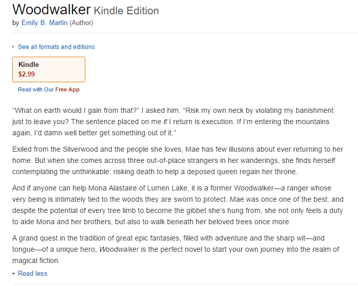 Three. Three references to execution in the back cover blurb. 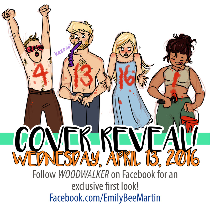 Here it comes! I am an extremely visual person by nature, so I am so stoked to finally be able to share Woodwalker's book cover with you! Keep an eye on my Facebook page and this blog on Wednesday for your first look!
I will be posting a special blog post about the process the art department and I went through to design and illustrate the cover. It was a process not without surprises and setbacks, but ultimately it led to the great result I will be sharing with you SIX DAYS FROM NOW! |
Emily B. MartinAuthor and Illustrator 
Archives
August 2020
Categories
All
|

 RSS Feed

