|
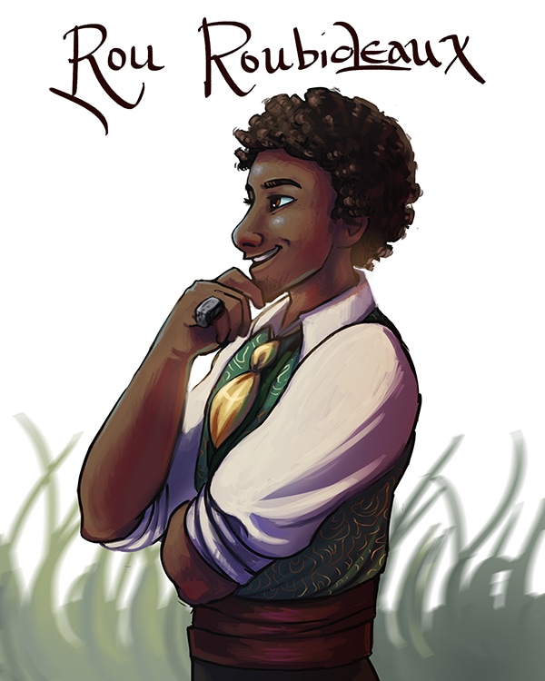
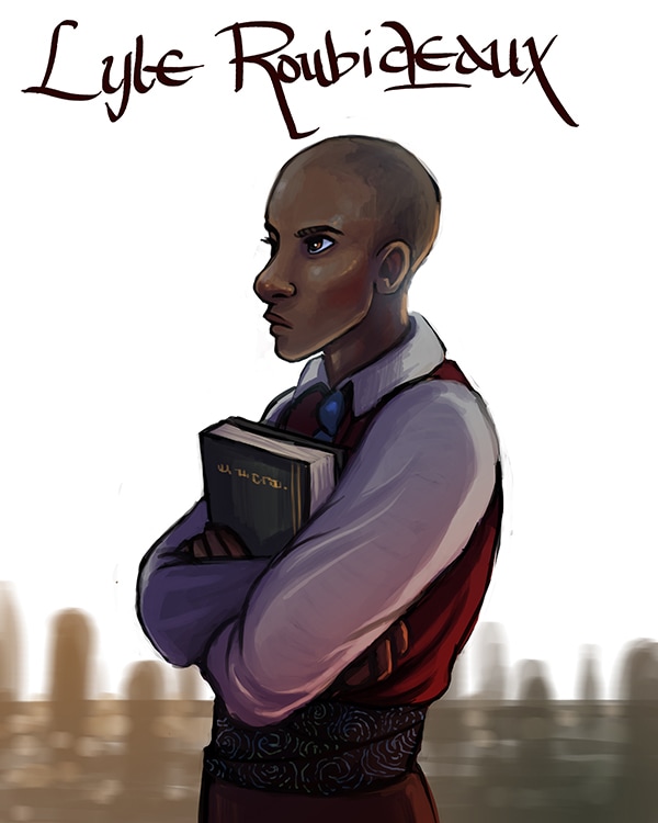
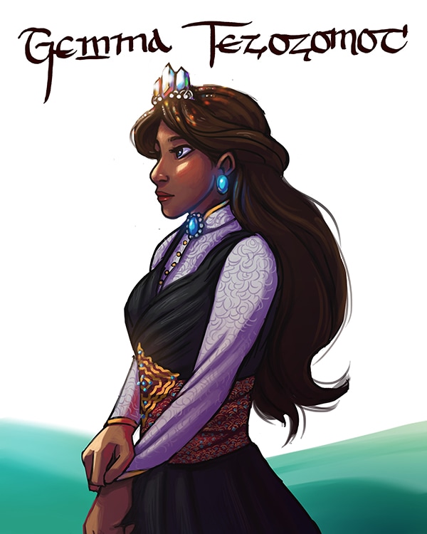
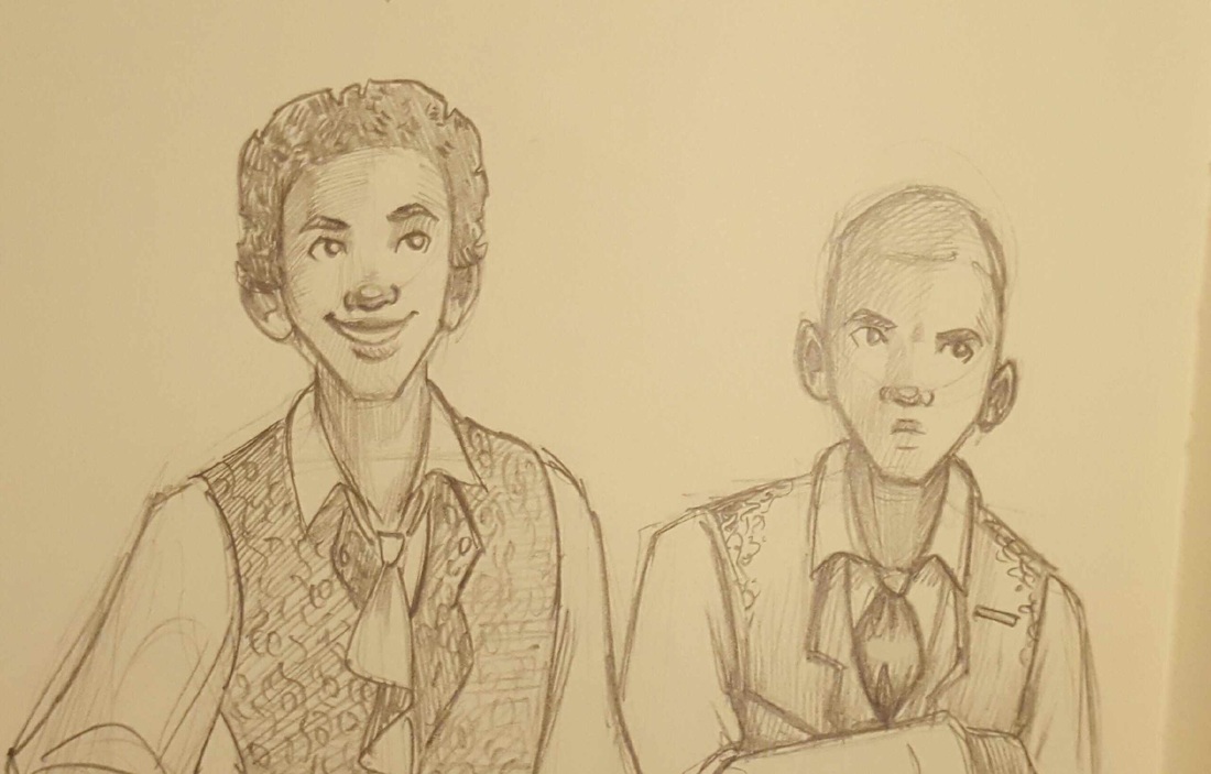
We are t-minus ONE WEEK from the e-release of ASHES TO FIRE! The e-book launches next Tuesday, January 31, 2017, and the paperback will follow a few weeks later. Woohoo! Readers will get to follow Mae, Mona, and the other characters from WOODWALKER on a new adventure--new stakes, new country, and new characters! Let's take a look... Ah, Mister Rou. His real name is Theophilius Roubideaux, but he thinks that's pretentious. Queen Mona describes him alternately as "indecent and asinine" and "insufferably likable." Part savvy diplomat, part impulsive swamp bandit, Rou has the distinct ability to charm his way out of most (self-wrought) sticky situations. He is a diametric opposite to cool, composed Mona, so obviously there could be absolutely no chemistry whatsoever between the two of them........... See more illustrations of Rou in my Portfolio! Rou's twin brother Lyle, however, couldn't be more different. Rou describes him to Mona as "downright surly on a good day... balancing long chemical reactions is his idea of a two-way conversation." But what he lacks in his twin's charisma, he makes up for in academic brilliance--Lyle is a wickedly talented chemist and engineer... and it can't be denied that Mona needs a tactical advantage over her enemies. Could Lyle be her ticket to finally protecting Lumen Lake from the threat of Alcoro? To see a little progress video of Lyle's illustration, see my Videos page! And after all, Alcoro is indeed a threat, led by their ruthless, tyrannical... quiet and compassionate Queen Gemma? Mona has no idea what to make of her enemy queen, partner to the despotic Seventh King Celeno who ordered the invasion of Lumen Lake four years previously. First impressions give way to second and third impressions, which eventually leave Mona wondering if she knows anything at all about the country that overthrew hers. One thing is for sure---it won't do to underestimate Gemma's role in this conflict, for good or bad.
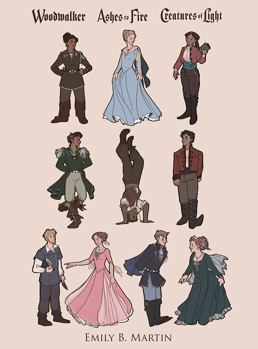
See these three illustrations alongside the other protagonists on my Characters page! (DRAMATIC ORCHESTRA STING) So, there are three of your new characters in ASHES TO FIRE. I will be posting a video in a day or two with more information about the book release, including some details on the launch party and what readers of WOODWALKER can expect in book two. Look for it on my Facebook page (I won't post it on my Videos page because it features my face instead of artwork). Thanks for following along on this adventure! Don't forget you can pre-order the e-book so you get it right on January 31, and you will be able to pre-order the paperback starting in February!
0 Comments
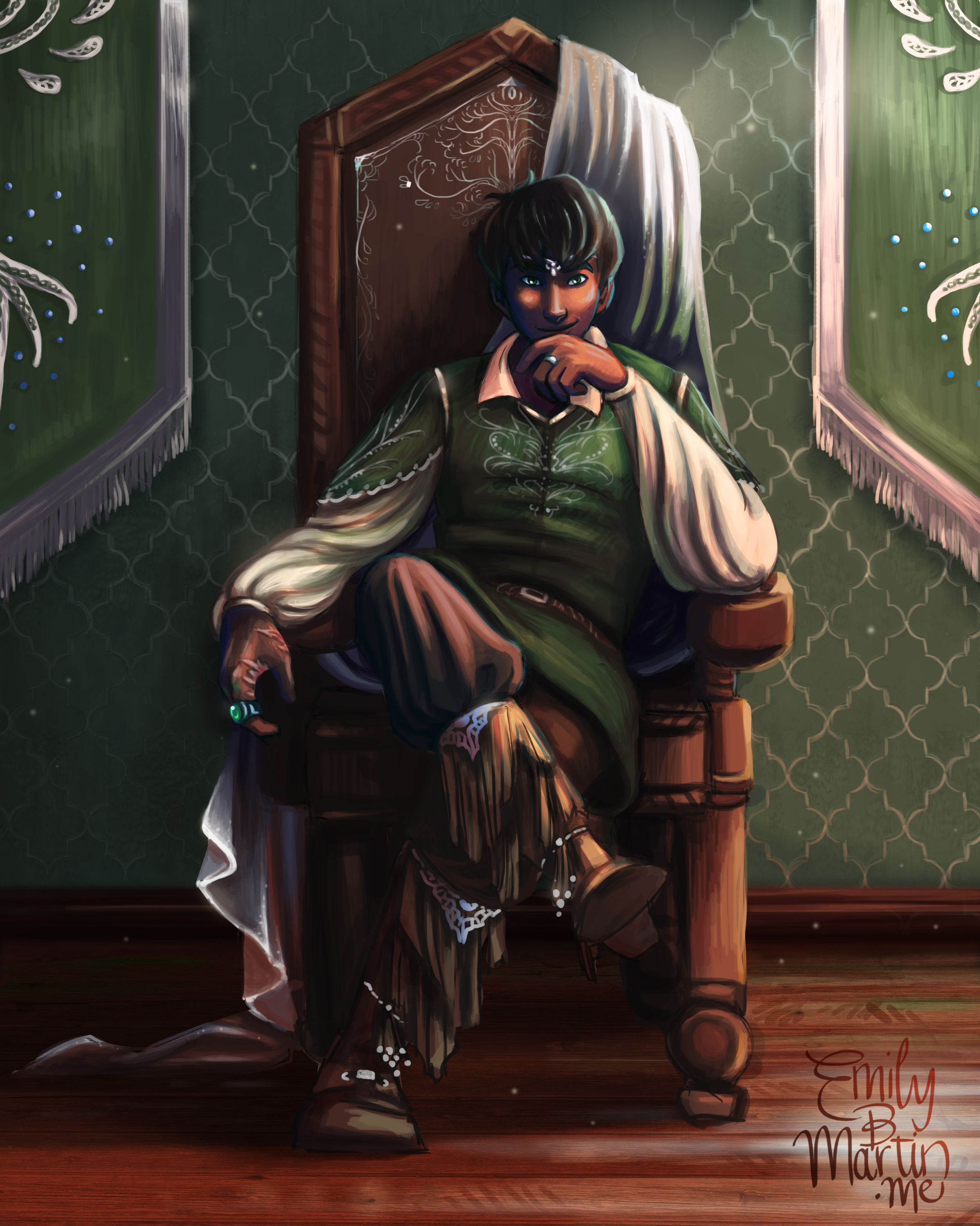
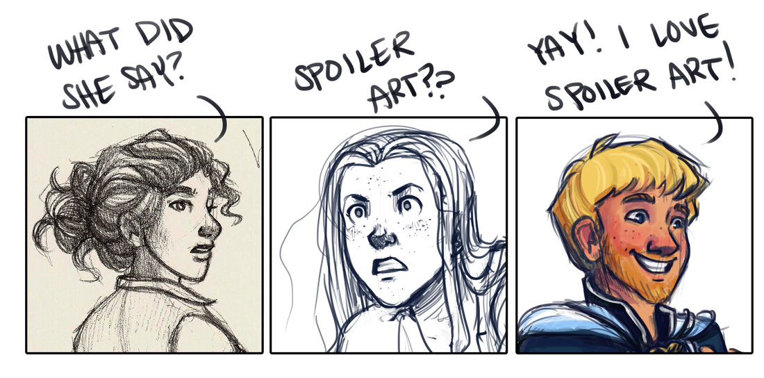
All I want for Christmas is 50 Amazon reviews! And we're so close! Right now Woodwalker is sitting at exactly 45 reviews—it only needs five more! Amazon is perhaps the biggest influence in a book’s sales, and 50 reviews is sort of their threshold for determining whether a book has a decent following or not. If you’ve read Woodwalker, whether you loved it or wanted to gouge out your eyeballs with compass needles by the end, would you please consider leaving a brief, honest review? Just like last time, as incentive, I have a second wave of spoiler art ready to go live on my website once we hit that magic number. Additionally, I’ll publicly post my most recent painting, a rather dashing portrait of Valien Bluesmoke, King of the Silverwood. Reviews on other sites, like Goodreads, are more than welcome, as well. As always, thank you so much for your support, and happy holiday season! Update: Woohoo, you did it!Barely two hours after this post went live, Woodwalker received its 50th Amazon review! As promised, there are ten brand-new highly spoilery pieces up in the Spoiler Gallery (spoiler: there are spoilers involved, so don't click if you want to remain unspoiled of the spoilers). And here is your GQ-esque portrait of cunning Valien, also on display in my portfolio: Thank you again for your support and feedback. Please continue to leave reviews for the books you read, particularly by lesser-known authors--they are the best tool for a book's success!
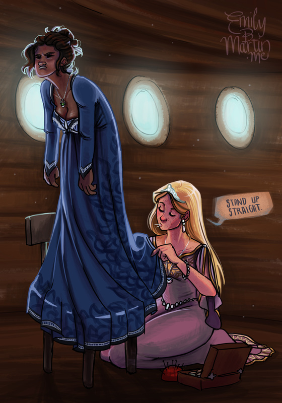
"What else did you bring?" I asked. "Tell me you brought something besides traveling tunics.” Mae glared at me. “In case you’d forgotten, we left the Silverwood in a bit of a hurry after a night of no sleep. I packed for battle, not tea and cookies.” “Rivers to the sea.” I pushed back my chair and stood. “You’ll have to borrow something of mine.” “Impossible.” “Why?” “Three reasons.” She pointed to her breasts. “One. Two.” She slapped her hips. “Three. And you’d have to hem about a foot off the bottom.” I went to my trunk. “We’ll make it work.” “Never.” “You doubt my sewing skills.” “I do. You’re not a miracle worker. Just let me wear my uniform.” “I saw it when we met with Atria. The knees are filthy. Tell me, what color is the cleanest pair of breeches you brought?” She sighed and propped her boots up on the end of her bunk. “Probably brown. Most of them are brown.” “Do you have gray?” “No, I don’t have gray. What does it matter?” “Brown’s a bad color for you. Muddies you.” She fanned herself in mock distress. “Oh, you cruel thing. To think I’ve gone this far in life not knowing…” I pulled out the richest color I had brought, a midnight blue gown with a square neckline. “You should consider wearing reds, or pastels.” “Pastels?” She spit the word out as if it tasted bad. “Something other than olive drab and brown.” “Maybe I’ll just go naked, so Celeno’s not offended,” she said vehemently. “And don’t slam green—it’s the color of our banner.” “Then let it stay on the banner. Get up,” I said, dragging a chair into the middle of the floor. “Let’s get to work.” “I thought we were supposed to be talking about something practical?” she said. “On the chair.” -Ashes to Fire One of my favorite exchanges between Mae and Mona in Ashes to Fire! I really love how the relationship between these two grows and changes through the two books. After the events of Woodwalker, they're able to appreciate and trust the other a lot more, leading to some great dialogue and action between them.
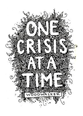
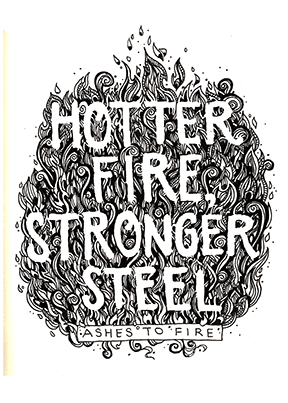
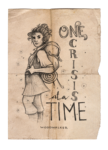
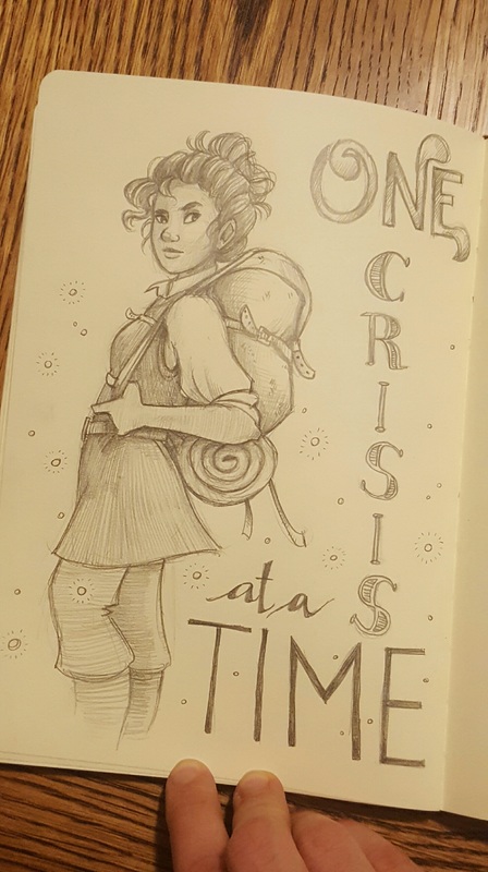
Ashes to Fire releases as an e-book on January 31, 2017! The paperback will follow a few weeks later. You can pre-order the e-book through HarperCollins for just $3.99. There are three new prints for sale in my INPRNT shop. The first two are pen-and-ink illustrations done as part of the Inktober challenge, when artists post ink drawings every day of October. The first is the now-beloved mantra of Mae in Woodwalker, while the second is the mantra of book two, Ashes to Fire! The third one is a pencil sketch done during a book signing a few weeks ago, once again featuring Mae and her favorite saying! To celebrate these new prints and the month of October in general, you can now take 10% off any purchase of my prints between today (October 7, 2016) and next Friday, October 14, 2016. Just use the code AZQASUII when checking out! Know someone who needs to remember to take things one crisis at a time? Get those holiday gifts purchased early! Maybe you need such a reminder plastered above your bed? Treat yo'self!
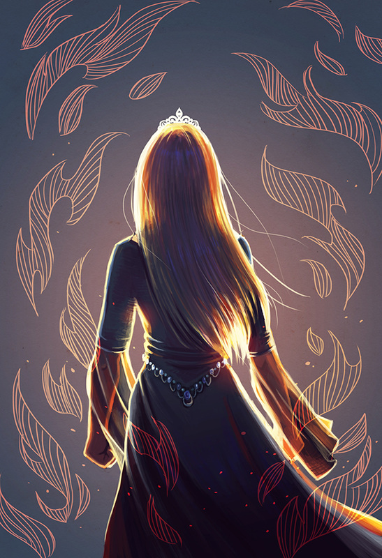
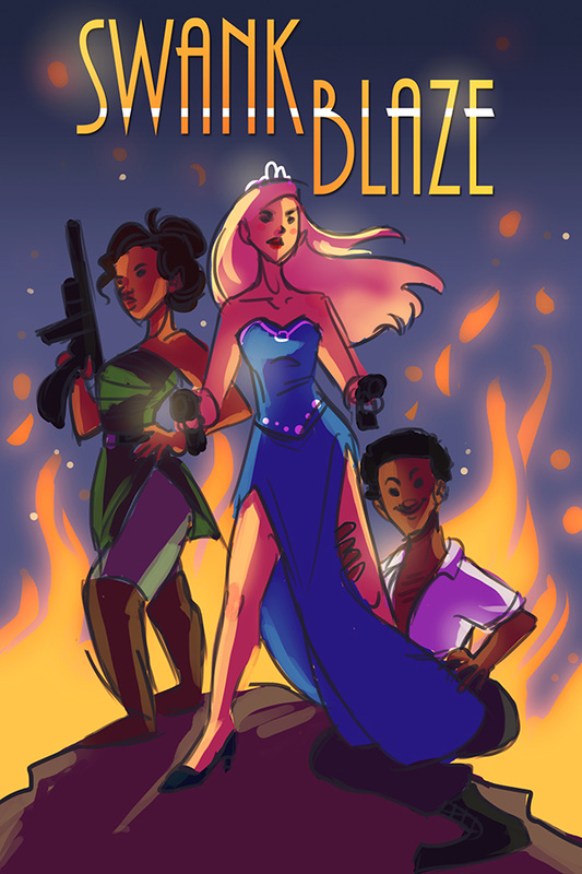
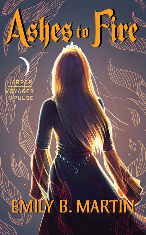
Ready for a descent into madness? Let’s go! When I wrote Woodwalker, I had the title pretty well set from the get-go. Short, relevant, evocative of the protagonist’s past, present, and future goals. As soon as I had given a name to Mae’s office, it naturally morphed into the title of the book. My agent and editor liked it. Easy peasey. The cover was the thing I got stuck on. It was important to me to get it right, and I didn’t always trust myself during the process (for the whole story, see my Evolution of a Cover post). It took a lot of pinning, redrawing, late-night crying, and faltering emails to get it to a place I felt comfortable. But the relieving thing was, once that design was set, I knew it would be no problem to design the other covers in the series. And I was right. I started the cover for Woodwalker’s follow-up novel shortly after finishing the first, mimicking the theme and altering the imagery to fit Mona’s story. Everything came very easily—her determined posture, the dramatic lighting, the stylistic fire overlay. I had a decent draft pretty well in hand before my editor ever got hold of the manuscript. Setbacks notwithstanding... However, the thing didn’t have a title. It was early, I reasoned. I had months before the manuscript would come up in my editor’s hopper. Plenty of time to ponder and pull apart the symbolism in the story, or to contrive some meaningful name from the dialogue. I didn’t worry about it, focusing instead on wrestling with the third manuscript—which, incidentally, does have a working title, as well as a mental draft of the cover. Time passed. I got angry at my third manuscript and started something new. That hit an unexpected wall and was replaced by another story. I focused on promotion for Woodwalker. I took on a bunch of art commissions for people. I did some book signings. I put on my park ranger hat and chased elk, and they chased me back. All the while, in the back of my mind, I was sure that one day, that elusive title for book 2 would effortlessly pop into my head. Spoiler: it didn’t. And so came that fateful day that my editor emailed me asking for a draft of my cover and the title I had in mind. Oh. The title. That I had in mind. About that… With nothing to send to him on that front, I started doing some title worksheets, teasing apart the main themes and struggles of the protagonists, writing down the imagery woven throughout and what it represented. And I’ll tell you what, the results I got were a glorious pile of steaming offal. I mean, they were terrible. When they weren’t terrible, they were obnoxiously cliché, things like “Fire and Water” and other names I really don’t want to write down because they are terrible. I tried a few more worksheets, copying the styles of famous titles using the imagery in my book. I tried re-wording certain passages in the book to force a meaningful string of words out of them. I even approached it like I approach my ranger programs, making lists of the tangible, intangible, and universal concepts present in the story. I appealed to my agent and editor, who both suggested I might be overthinking things. I didn’t know how else to approach it, though. I had tried not thinking for about four months, and that did no good. As with the cover rigmarole for Woodwalker, I brought the matter to my husband, and we began a sort of hilarious late-night quest deep through Thesaurus.com, searching for words to describe Mona’s physical and emotional journey. This produced some quality gems that would have probably necessitated having Fabio on the cover alongside Mona—things like Smoldering Ember, Virgin Flame, and Vestal Smoke. “Swank!” my husband cried, now half an hour deep in the thesaurus. “Swank is a colloquial synonym for ‘new!’ Swank Blaze!” “God, I don’t know what to do,” I said. “Swank Blaze!” After extensive note-taking and telling my husband I would include Swank Blaze on my list (I didn’t), I wound up with a page of titles I disliked less than others. Embarrassed at their poor quality, I sent it out to my beta readers for feedback. At the very bottom of the list was: “Ashes to Fire (okay, I lied, I hate this one, but it sucks less than some others)” I did not like Ashes to Fire. To me it screamed melodrama—intense, meaningless words with a nonsensical article thrown in between them. Boo, you piece of crap title. I went to bed angry at words in general. I woke up with an email from one of my beta readers. This particular reader I can always trust to hone in on the symbolism and heart of the narrative. Okay, so it was my mom. She had zeroed in on Ashes to Fire. “I like this one best,” she wrote. “It’s a paradox—how do you go from ashes to fire? You can coax a fire from ashes if there are still embers burning.” Bam! She had, in essence, summed up Mona’s emotional journey, the political intrigue, and the spirituality of book 2’s narrative in one short sentence. Ashes to Fire turned from being a string of meaningless words into a short, dynamic summation of the heart of the book. (As an aside: many authors I talk to are surprised that several of my beta readers are my immediate family. They say they’d never send their unpublished work to their family members. For my part, I can’t imagine not sending mine to them. This is, in part, why: my family is pretty fly.) I sent the title to my agent, who sent it to my editor, who responded quickly that he liked it, and that was that. I got him the final draft of the cover, and within a few days, he sent it back with that title slapped across the top. This publishing world is weird. Some things create massive drama, some barely cause a whisper. I have gotten far more worked up over these manuscripts than I have over parenting (“what? Oh, here, slap a Band-Aid on it and have a cookie.”). I described myself as an over-emotional pudding cup to Twitter during one particular meltdown, despite having assisted in search and rescue and solo-backpacking 40 miles through New Mexico. This is just how it is. This is just how I am. This is how I create and write.
Nothing arrives on paper fully-formed. Every book or painting or other masterpiece is the result of effort and a lifetime of work. And I know I, personally, couldn’t do it without my pool of supportive family, friends, community of authors, and bastion of literary professionals helping me keep up the appearance of sanity. On that note, I hope my husband will forgive me some day. This evening I experienced what has been, so far, the most fulfilling moment of my fledgling career as an author. I had a book signing at our local Books-a-Million, and I signed and sold a decent number of copies. Things started off slow, so I had ample time to sketch in between interested readers. Behind me was the poster I put together showcasing the five main characters of WOODWALKER—Mae, the protagonist, Mona, Colm, Arlen, and Valien. Sketching is often a good way to draw people in, and it worked for a mother and her two twin daughters, probably ten years old or so. They came to see what I was doing and exclaimed over the picture of Mae I was doodling. They asked about the book, and while they were a few years younger than the intended audience, I told them about how it was an adventure story starring a girl, which got them excited. They begged their mom to buy the book, and she agreed, saying that even if it was a little old for them, at least they would learn some new vocabulary words. After I wrote their names in the book and signed it, I showed them the picture I had been drawing again. “She’s the main character,” I said. And I pointed behind me at the poster, which is full color. “And that’s her, too.” “Girls,” said their mother. “Look at her skin.” The two girls looked at the poster and saw that Mae’s skin was brown like theirs. One of them looked back at me and put her arm around my shoulder. “Can I give you a hug?” she asked. I hugged her and her sister tightly and told them I hoped they liked the book. Despite how important the issue of diversity and inclusivity is to me, I find it very hard to talk about. I don’t post about it much, concerned about coming across as a “theater ally,” someone who acts a certain way only in the interest of having it reflect positively back on them. I think Twitter is partly to blame. For every sound opinion, there seems to be an equally sound conflicting one. Some people think white people should use our privilege to be vocal, some think we should be silent to let marginalized voices be heard. Some say we should identify ourselves as allies, some say we should cut it out with labeling ourselves allies in the interest of avoiding the aforementioned theatrics.
I struggle with whether I have the right to write a Cherokee-inspired character in Mae, or a black character in Rou, or a Latina character in Gemma. I struggle with how to write an epic fantasy set in an American world without appropriating culture. I struggle with wanting to tell everyone about my diverse cast of characters, wanting to insert myself in the “we need diverse books!” hashtags. I worry about unconsciously stereotyping. And I know I have little right to complain about the complexities of writing these characters, when at least I have the privilege of my voice being heard, rather than silenced, misconstrued, or told to change. So I tend to err on the side of silence, hoping that instead my work will just speak for itself. And tonight, it did. Two little girls saw themselves represented in the hero of a fantasy-adventure novel, just like I saw myself in Daine, and Matilda, and Saaski. Even this post feels slightly theatrical and disingenuous. But my gratefulness to those girls and their mother is real, and not because it makes me look good, but because this is the ultimate goal I've been working towards all this time--using my work to nudge inclusivity just a bit further. I wanted to tell them to wait until book two—that the romantic interest, and perhaps my favorite character I’ve written so far, is a young black man. But I didn’t. I just hugged them and thanked them for buying my book. I thanked their mother, and I told her this was important to me. I hope they like it. Here’s the thing. I have THREE SKETCHBOOKS full of Woodwalker art. Some of it you’ve seen already, and some will never see the light of day, but much of it I haven’t been able to share because it contains massive spoilers. But, many of you have now read the book and joined Mae and the others in their adventures, and I’d like to post a special exclusive fancypants portfolio for you on my website—filled with nothing but spoiler art. SO here’s how this will work. Right now I am sitting at 23 customer reviews of Woodwalker on Amazon. The magic number is 50—that’s when Amazon starts taking a book somewhat seriously. Help me reach 35 reviews—that’s 12 more—and I will upload my Spoiler Gallery to my website, with much of my sketchbook art and some finished pieces. Help me reach 50 and I’ll upload a second wave and do a prize giveaway. Reviews don’t have to be long or involved, and they don’t even have to be good reviews (though, of course, it’s preferable). They can be one sentence, or even just a few words. “Thrilling! Would recommend!” “Boring! Don’t waste your time!” “Appalling! Who approved this crap?” Or it can be a multi-paragraph dissertation on my shallow worldbuilding and overuse of the word “folk.” Whatever moves you! But in the publishing industry, it’s the reviews that count, not just the ratings. This is kind of like when the teacher says if the entire class completes end-of-semester course evaluations, they’ll all get a reward—only instead of a bonus point on your final, you get kissing pictures. Edit 8/19/16: First Goal Reached!!We've reached 35 reviews on Amazon! That means the Spoiler Art gallery is now live! Thank you all so much!
For a second wave of art and a prize giveaway, let's work on getting 50 reviews! Friends, I think the only way we make progress is when we stop saying "you, you, you" and start saying "I, I, I."
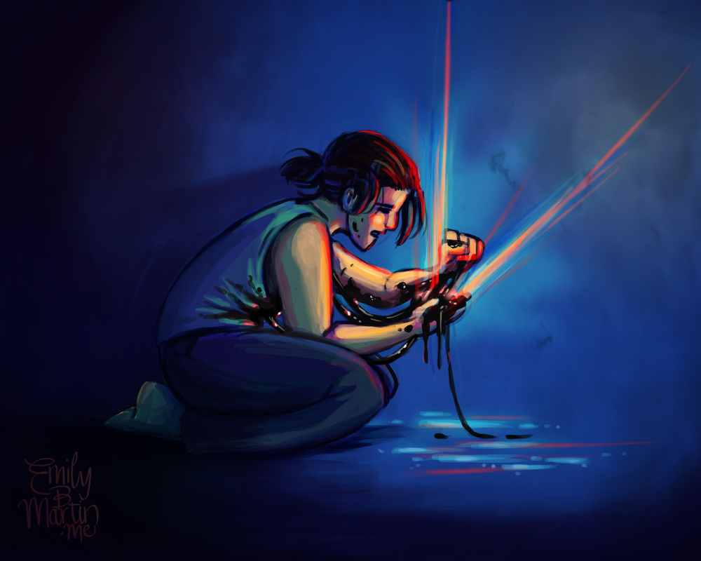
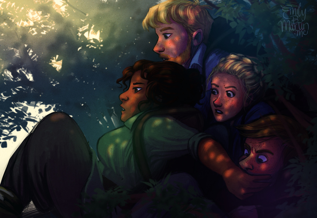
I am racist. I have made assumptions and had disrespectful thoughts based solely on someone's race. I have wrapped myself in my privilege and kept silent. And so... I promise to listen. I promise to take it upon myself to learn, and not force someone to teach me. I promise to believe that someone's pain is real even though it is not my lived experience. I promise to stop and examine myself when I make assumptions and look for justification. I promise to be more inclusive in my home life, in my work, in my parenting, in my writing, and in my art. I promise to work to undo the ramifications of my silence and privilege. We had our first truly close call a few days later. We had just scrambled over a bulge of rock ribbing the mountainside, pocketed with patches of moss and fringed with dense azalea thickets. I was correcting my bearing; the siblings were behind me, holding some discussion. I found my landmark and was slipping my compass back into its pouch when the slightest noise filtered up the rock face. Woodwalker releases in 24 days! I am developing a lot of new illustrations for the website, which will go live after the e-book launches on May 17. I wanted to put something up in the meantime, though, so I finished this piece I started a while ago. It quickly became both overworked and lazy (somehow), and no closer to achieving the loose, dynamic style I keep aiming for, but here it is nonetheless.
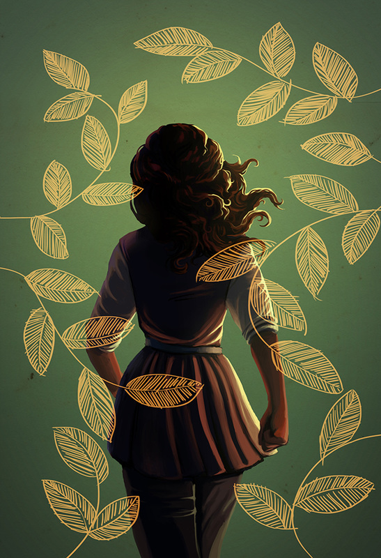
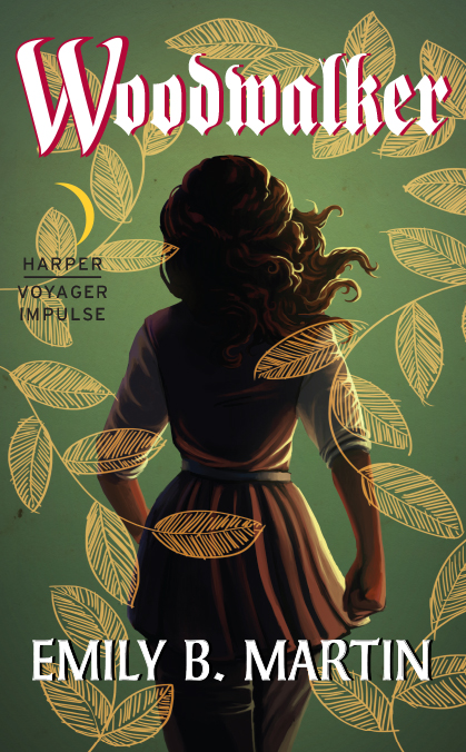
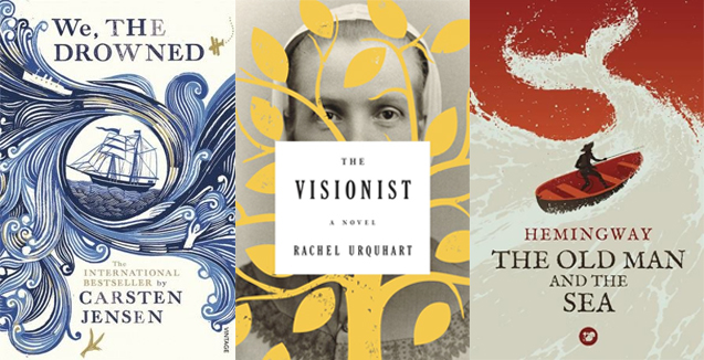
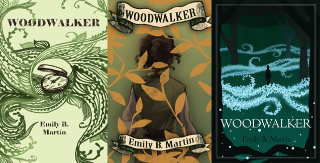
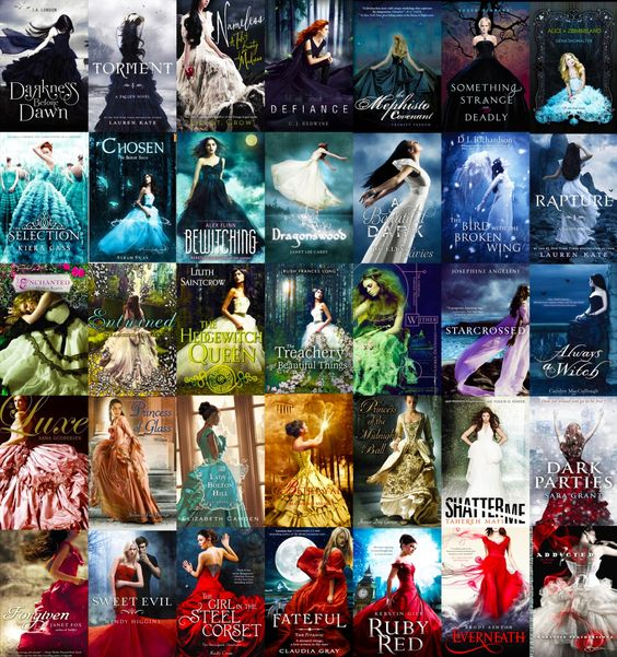
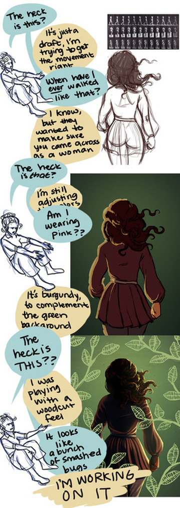
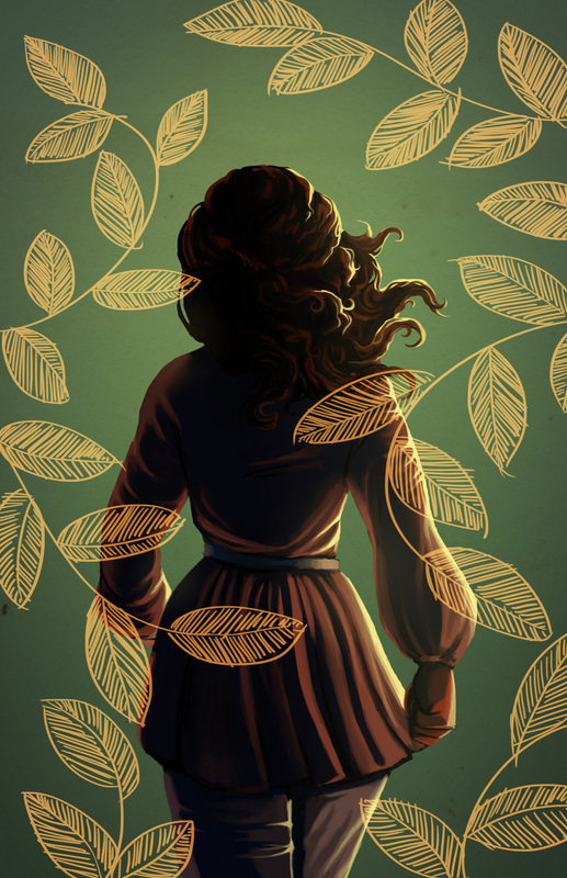
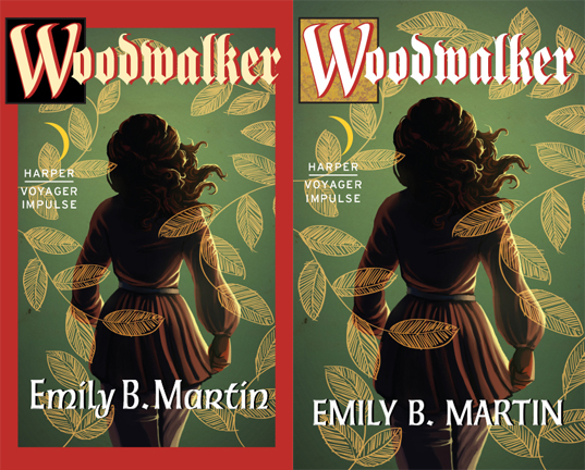
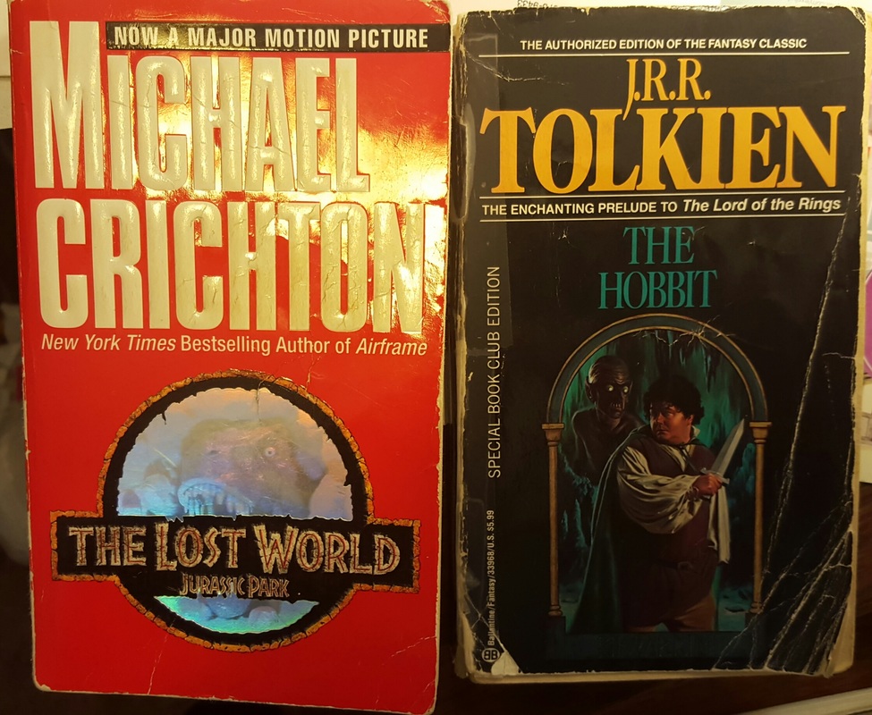
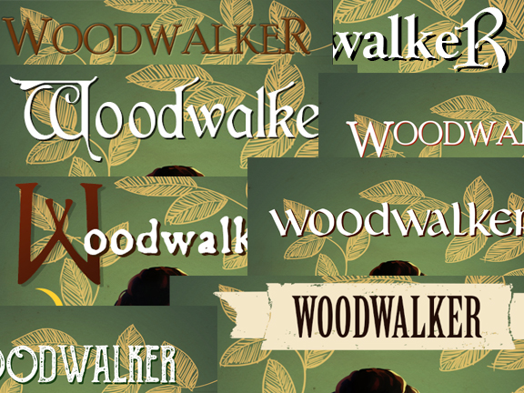
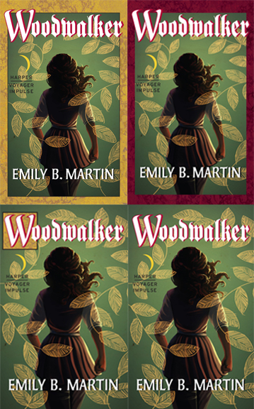
It's here! In just the past few weeks, Woodwalker has gone from a word document still undergoing edits to a finalized product. The final copyedits are done, the text has been formatted, and the thing has a COVER! Let’s be honest—people judge books by their covers. We can’t help it. A good cover draws us in, piques our curiosity. A bad cover makes us pass it over for something else. It’s a critical part of any book, and one I hoped would turn out right for Woodwalker. Several months ago, when I began telling people that my book had been picked up for publication, the most frequent question I got was, “are you going to do the cover?” At that early stage, I could truthfully say, “I don’t know”—I wasn’t sure how involved I was going to be in the process. And, in a way, I didn’t mind if I wasn’t allowed to work on the cover. Like most artists, I have a delicate relationship with my artwork. I’ll finish a piece with immense satisfaction, sure it’s going to be the crown jewel of my portfolio, only to come back to it a few days later and realize with dismay it’s nothing but the same crap I produce week after week. There’s one storybook I wrote and illustrated for my girls that I try to avoid reading at all costs, because the illustrations nag me so much. In that respect, I didn’t want to illustrate the cover and then have it hanging over me for the rest of my life, knowing at this point next year I might barely be able to look at it. I looked forward to what another artist might dream up for the design. And because it’s such an important part of a book’s appeal, I felt more comfortable leaving it up to industry professionals. One of the first things my editor asked me to do upon signing our contract was put together a Pinterest board of book covers I liked, so the art department could have some starting points (you can find that board here, if you’re interested). I did some research and a whole lot of pinning, and I realized I was drawn to artistic covers with stylized elements, rather than photos or ultra-bold graphic designs. Here were some of my favorites: But then, me being me, I couldn’t just leave it at that. I sketched up a few drafts of what Woodwalker might look like with some of these elements. I sent the pin board and my sketches to my editor and the art director, thinking they would either take my designs and run with them, or they’d discard them for something else. I wasn’t too beat up about it. The only thing I knew for sure I wanted to avoid was a Photoshopped image of a white girl in a prom dress staring into space. To my surprise, they sent me back one of my sketches and said they’d like to see another draft. It was the cover inspired by The Visionist and featured a shot of Mae marching away from the reader, overlaid with a foliage design. Their suggestions were altering the colors to make Mae stand out a little more, and to be sure she came across as a woman by changing her hair and clothes. So I got back to work. When I illustrate Mae, I almost always put her in green or brown and put her hair up in a knot (she hates having it loose). But I made myself stretch her design a bit to meet the recommendations of my art director (if there’s one thing I’m learning about writing, editing, and publishing, it’s that industry professionals are usually right). After a little more back and forth, we ended up with this draft: My art director emailed me back saying it was great and he would take it from there in terms of adding the text and other elements to the front and back covers. Several weeks later, I received two drafts from my editor with the title and additional elements added. I have to say, I was caught off guard at first. Cherry red accent color? Heavy, gothic font? On a book about an unpretentious treehugger and her Lothlorien-meets-Appalachian homeland? It was... not entirely what I had expected. It felt a little out of date to me, like it belonged in between my ‘90s copy of The Lost World and my ‘70s copy of The Hobbit. But I made myself wait, live with them for a day—like I said, industry professionals are usually right about things like this. By the next day, I had decided I could maybe live with the second, but it hurt me a little inside. It just didn’t have the organic, artistic feel I wanted, and it wasn’t something that would capture my interest in a bookstore. But I also didn’t want to be needy or demanding or, worst of all, make a decision that would negatively impact my book. Compounding my angst was my own experience on the artist’s end of these types of projects. I’ve had clients who commission a design or illustration, only to hate whatever I come up with and request changes that I think are detrimental to the design—ultra-detailed logos that don’t read at a small size, abysmal color choices, fonts that induce vertigo. I’ve reworked products to create something much less visually appealing and usually try to scour them from my portfolio afterwards. I didn’t want to do anything like that here—project my own preferences onto the book cover to the point of negating the expertise of my editor. At the eleventh hour, I also realized another thing that was bothering me—Mae didn’t look like Mae. This was my own fault—in trying to make sure Mae read as a woman, I somehow lost some of her character. At the time, I think I dismissed this as me being too closely tied to my own character design—what cover ever really manages to capture the protagonist? I have three different cover suites on my copies of Megan Whalen Turner’s Queen’s Thief series—one makes Gen look like a Mediterranean twenty-something, one makes him look like my dad, and one makes him look like a white twelve-year old. None of them impacted my enjoyment of the books. No big deal, I thought. But ack, now it was a big deal, especially with the uneasiness I felt with the rest of the design. Hastily I pulled up my original illustration and began reworking some of it (by this point I was losing sleep and the patience of my husband). I took away Mae’s billowy sleeves and replaced them with a design I often use when drawing her—a separate shirt under her tunic, with the sleeves rolled up. I felt much happier with that look—to me it conveyed a sense of readiness and action. This was also well after midnight, so I was probably approaching delirium anyway. At the advice of my agent (and my husband, who was getting irritated with my drama), I told my editor the cover designs didn’t feel quite right to me, and I asked if we could do a few variations with other fonts and colors. I sent him the revised illustration and some examples of other books I liked. After some back-and-forth, he sent me an updated set with some different variations. While the font and red drop shadow didn’t change, other elements did, and ultimately they felt a lot better to me than before. After another day of waffling and polling my agent, beta readers, and daughters (“Which one do you like?” “Oh, a moon!”), I settled on the fourth one. I was drawn to the simple design, and the title font didn’t feel quite so out of place to me. And so we have the final product. The good thing about revising the illustration at the last minute is that it resolved some of my original fears—that a few months down the line, there would be things I couldn’t stand about it. In the months since I first drafted it, I’ve learned a lot about bounce light and color balance, and I was able to improve some of that with the revision. Lesson learned—I’m going to illustrate the cover for the second book now, so I can revisit it in a few months and make it better.
Ultimately, I’m happy with how it turned out, and in the end, I’m so, so thankful I got to do the illustration myself. I’m grateful to my editor and the art department for working with me, and to everyone who gave me feedback during the process. I’ve had time to get to know the font and color and make friends with them. I love Mae’s purposeful forward march, which I think communicates her confidence and drive. I think the leaf overlay lends an eye-catching graphic feel that will be recognizable on the shelf or as an online thumbnail. And the design lends itself well to the rest of the trilogy—each book can have its own variation, making it nice and cohesive. So! That’s that. Woodwalker has a cover. It has a title page, a dedication, acknowledgements. It has a summary on retailer websites and a variety of genre categories. It has a publication date. All it needs now are readers. |
Emily B. MartinAuthor and Illustrator Archives
August 2020
Categories
All
|




 RSS Feed

