 I’ll start by saying that I tried really, really hard to have a progress video, or at least an illustrated tutorial for February’s “for artists” blog post, but as you may have seen on social media, the universe was against me this month. I’d set up a screencap video for the piece of Remus Lupin below, but it failed thirteen minutes in. So I tried to capture a different illustration on my phone, but I kept running out of memory, and then half the clips were eaten by Internet goblins when I tried to transfer them to the cloud. So I set about doing a simple face and shading tutorial, when I realized that with the frustration of everything else, I apparently no longer could draw a face, at which point I nearly gave up on February entirely. 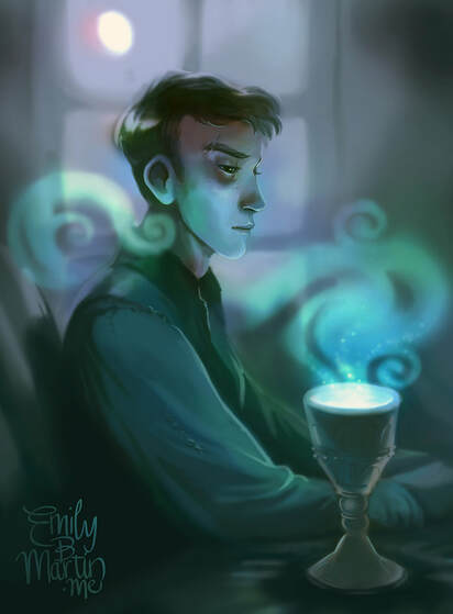 My boggart is this blog post. So finally, as I came down the wire, I decided to give you something that didn’t require me to draw anything new at all, and that’s to share my method of setting long-term goals to progress my art. I started doing this several years ago—setting specific objectives, usually at the beginning of the calendar year, of what skills and concepts I wanted to practice next. Most of these goals were easy to come by—they were often concepts I was struggling with or felt like my pieces were lacking. But sometimes our weak points aren’t easy to pinpoint—these are great reasons to have artist friends or crit groups that will give you honest, supportive feedback. I’ll share a few of these resources at the end of the post. So! It seems I’ve saved February’s art blog at the eleventh hour, despite the best efforts of a vengeful universe/crippling professional anxiety. Here are the stylistic roads I’ve journeyed on the past five years, the resources that helped me slowly progress, and where I hope to head this year. Includes Ye Olde Arte and some pieces I’d really rather bury but am posting for your amusement. See it all below the jump! 2015: Achieving Depth
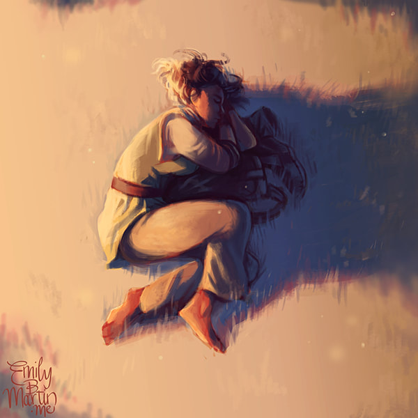
This leap into the professional world, along with talk of building an author “brand” and a robust online presence, made me start thinking a lot more about my art and the direction I wanted it to take. My art during the New Mom Years had been sporadic and directionless, and I’d progressed very little since college. Now I wanted it to grow and be something I could use in tandem with my books. So I settled on something I thought was lacking in my work: depth. In the beginning, the only way I really knew how to achieve depth was through blurring—making the foreground sharp and the background blurry. I knew light, value, and color had something to do with it, but I only had the barest grasp on how that worked. (Spoiler: I still don’t understand how those things work, but I’m better at making them do my bidding regardless.) 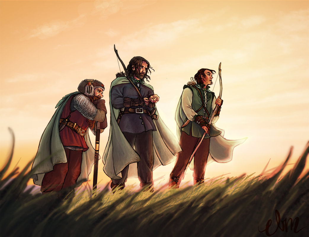 I made some breakthrough with this piece above, forcing myself to merely hint at the foreground and background rather than detail it. I missed the mark on the piece below, the very first digital concept I did of Mae, where I regressed into finessing the piece into oblivion, relying at the last minute on a pre-fab Photoshop lens filter to add focus. 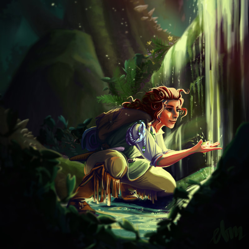 But slowly I started getting the knack of simply suggesting my background, even though I was still painting in the same saturated colors as my foregrounds.
By the end of 2015, I was doing a better job of envisioning distance and creating a piece that had some atmosphere to it. But man, something had to be done about my tendency to work a piece into the ground… 2016: Quicker and Broader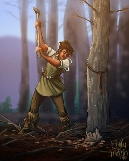 January of 2016, I painted this piece, referenced from a photo of a WWII lumberjill. I liked the energy of my initial sketch, and I put my work the previous year to use in distancing the background, but the thing that kept me from loving the piece was how stiff and motionless it felt. I mooned over other artists who managed to capture their subjects in rough, fast brush strokes, bringing energy and richness to their work without bogging it down in details. So I set a new goal for myself: Speedpainting! And I learned a very fast lesson. Speedpainting is f*#king hard! 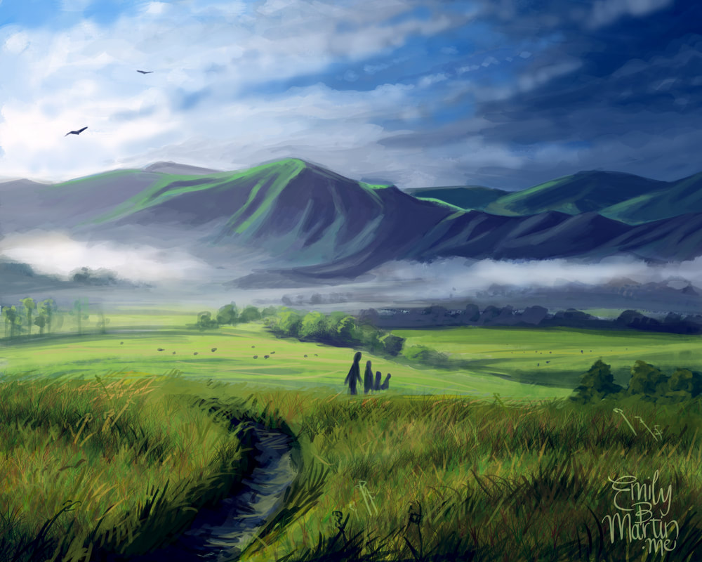 It looks like it should be easy. Zoom out, throw fast strokes down, and don’t fret over the details. But just like distilling a 70,000-word novel into a 200-word query letter, speedpainting requires a precise knowledge of exactly what needs to be on the page. It requires a robust understanding of composition and value, and often, prep work beforehand. Those were skills I was and still am a long way from mastering, and so my early attempts at speedpainting were immensely frustrating.
But--like my work on depth--repetition and practice helped me relax my work and move a little faster. It helped train my eye to identify the important parts of a piece and made me more comfortable with working at a macro, zoomed-out level. I want to be clear—I’m still not a very strong speedpainter, and it’s something I still practice a lot. That’s the key here—just because I have a new goal from year to year doesn’t mean I’ve completely mastered the previous year’s goal. But by the end of 2016, the focus on moving faster and broader did help me retain more energy in my work.
As the next year dawned, though I found I had new problems… 2017: Maturing and Quieting
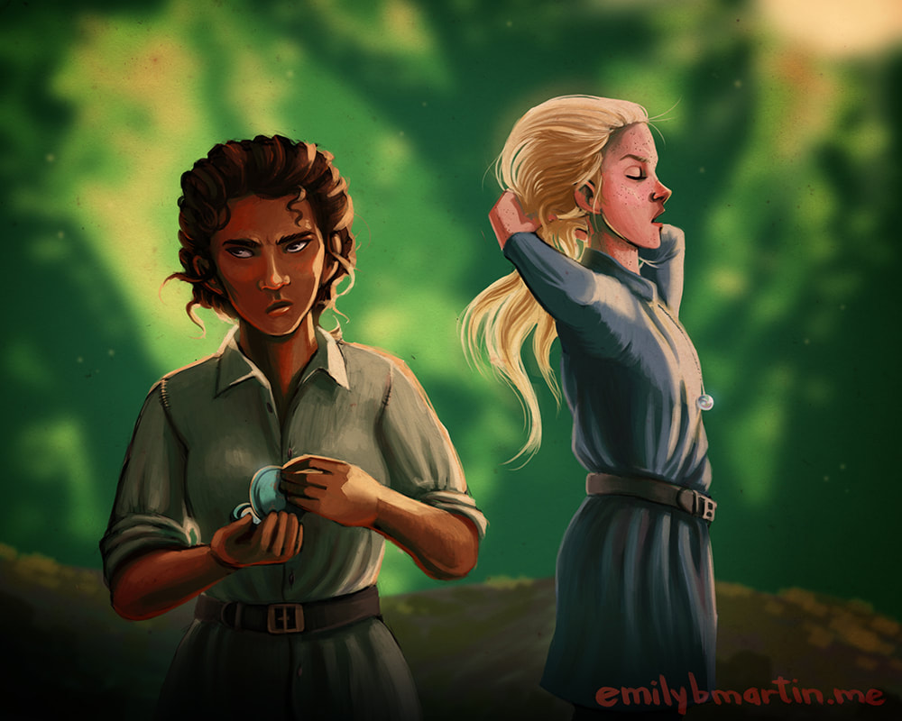
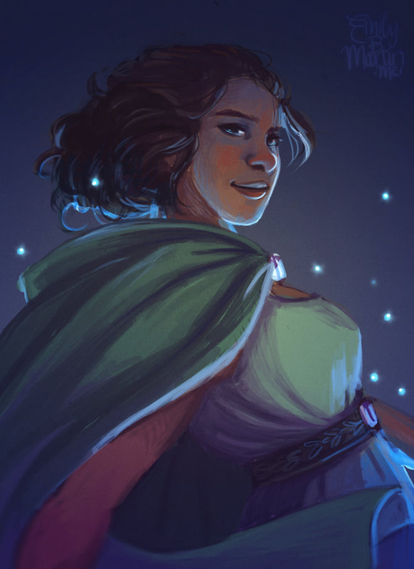
 WHY DOES NO ONE TAKE ME SERIOUSLY? So I leaped into 2017 in almost a panic—what do I do? How could I rectify the fact that my novels were for young adults, but my art looked like it was for a fifth-grade book fair? My art style had changed very little since I first studied the cartoony Harry Potter fan art of artists like Tealin and Makani circa 2002. Could I prune it into something that better channeled the older audience of my books? Was that wrong, to force my art to be something it wasn’t? Was it something it wasn’t, or something it just hadn’t become yet? (Things got existential.) 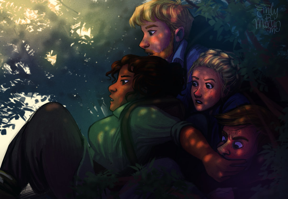 Color, I decided. Color was a major factor, along with my roots in mimicking Disney character design. To mature my style, I first needed to quiet the unicorn riot happening in my palettes, as well as find a more realistic shorthand for faces. I settled into a spate of illustrations with a very limited palette, laying down one primary color and adding only minimal accents.
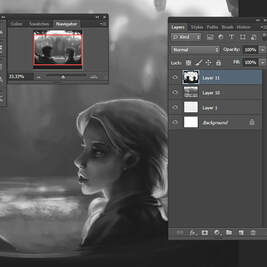
One thing this forced me to do was focus on value more than color. Value, in a crude explanation, is essentially looking at a piece in grayscale. It makes sure the piece translates by virtue of light and dark, rather than hue. I actually did a few experimental pieces where I painted the image first in grayscale and then added color. I liked the value painting but never liked the colorization—they always looked muddy. But it was great practice.
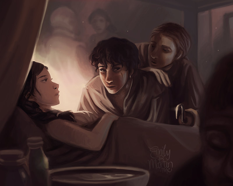
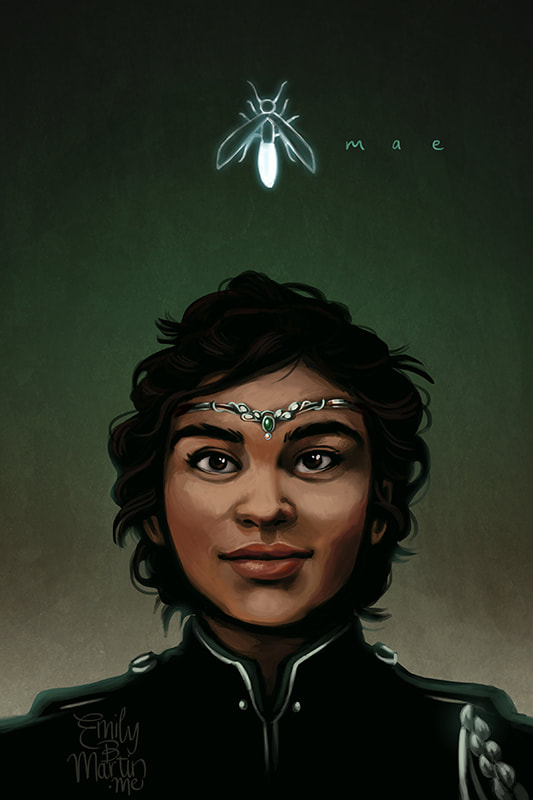
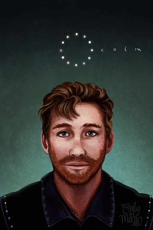
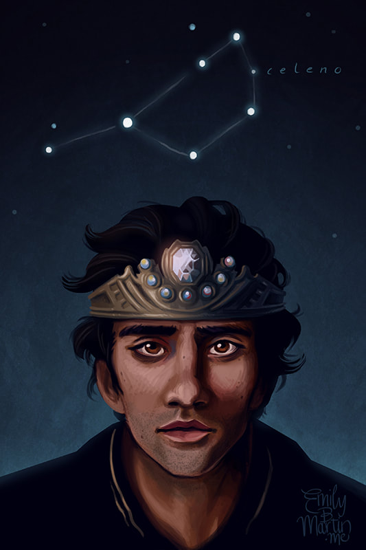
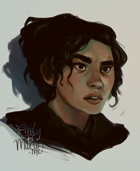
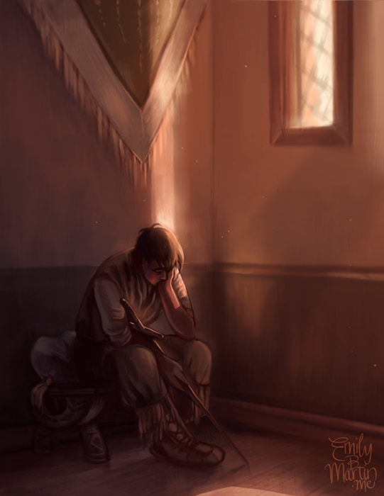
To internalize a more realistic facial construction, I did a series of character portraits based off photographs. These helped me pinpoint some of my issues—much of it rested in how I drew eyes. I forced myself to make eyes smaller and less shiny, and to add an appreciable amount of grunge and pigment to the corners and lids. Small blemishes and five o’clock shadows helped add some complexity and realism not present in my earlier cartoony pieces.
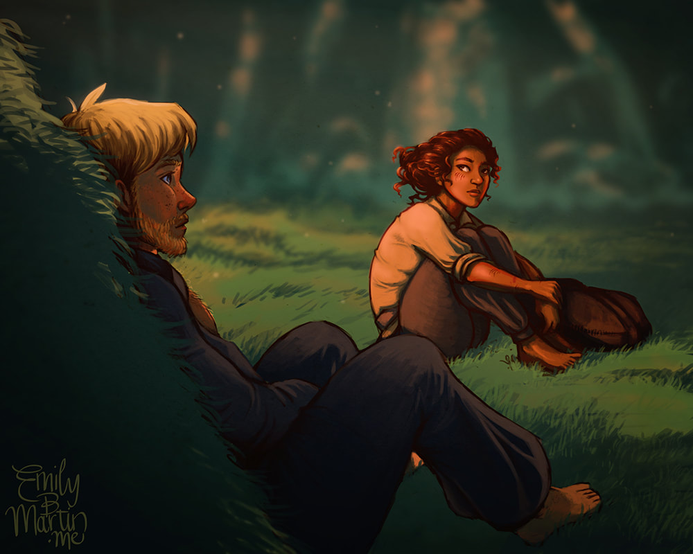
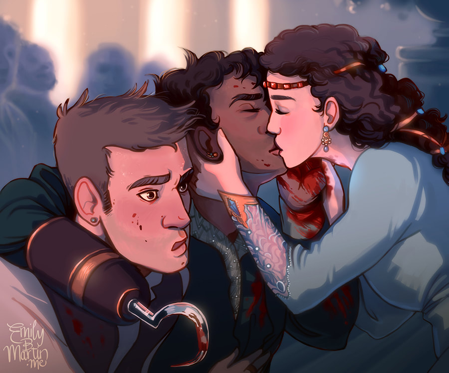
Face models: Kawennáhere Devery Jacobs, Dean O'Gorman, Oscar Isaac. You can find a progress video for the image of Mae in my Videos tab. My work toward the end of 2017 leans toward the stoic and realistic, with subtle palettes and subdued mood.
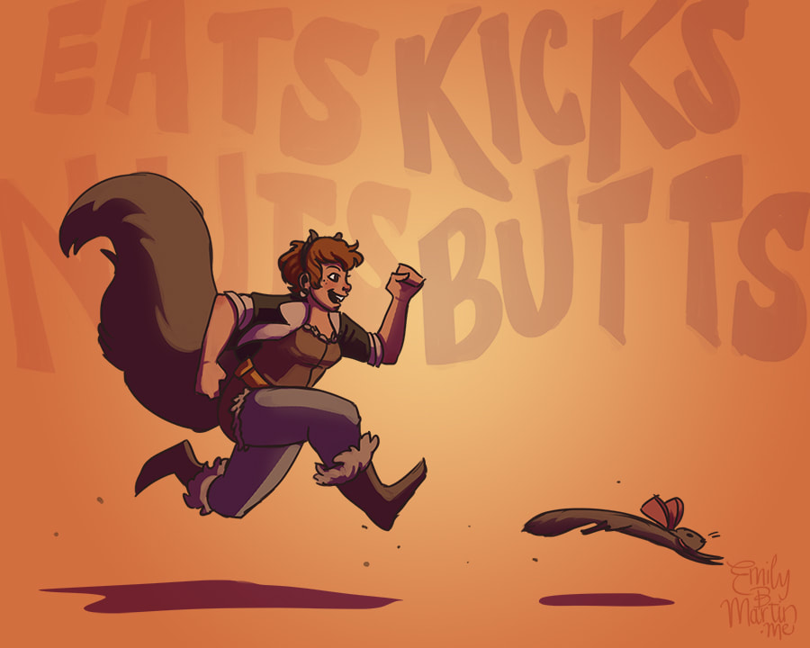
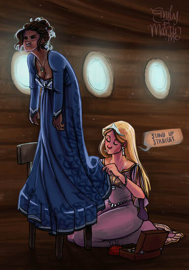
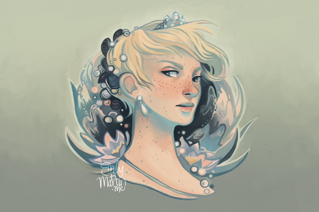
2018: Finding the Art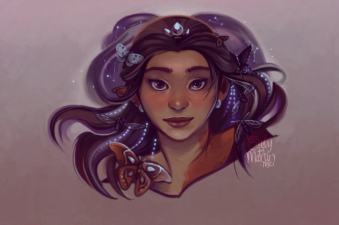 For Christmas 2017, one of the gifts I asked for was an artbook from one of my favorite artists, Lois van Baarle. I received it all shiny and beautiful and dived into it. And in the same way that Megan Whalen Turner’s work reminds me why I love writing, Loish’s artbook suddenly reminded me why I love not just art, but illustrative work in particular. She does such an amazing job at incorporating rich color, whimsy, and sheer artistry into her pieces… and they don’t feel juvenile or amateurish at all. I realized that the past few years had helped me achieve great things in my art—arguably the biggest strides I’d made since middle school. Now it was time to synthesize all that I’d learned back into my natural style.
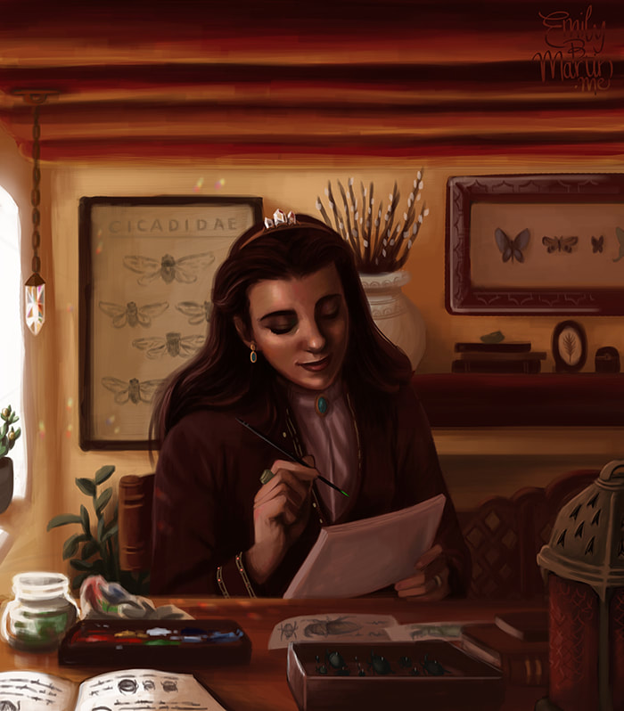
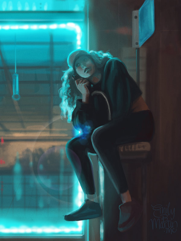
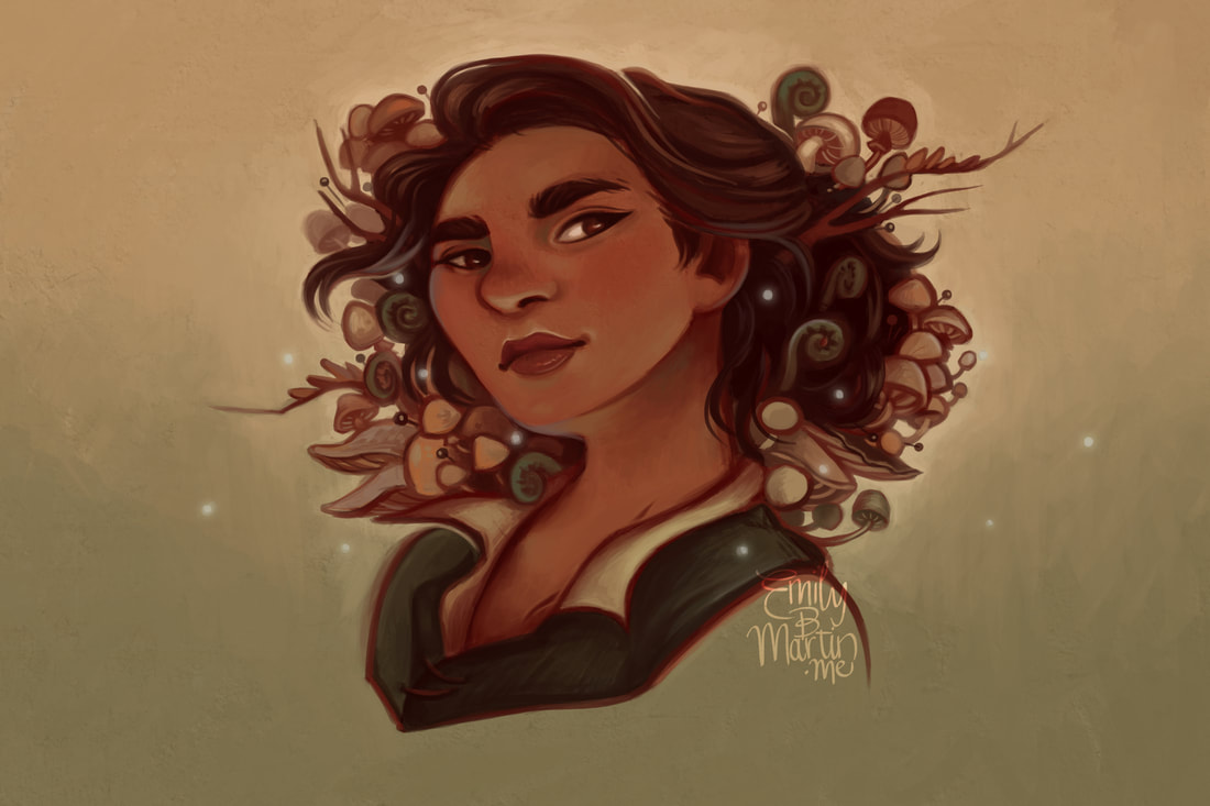
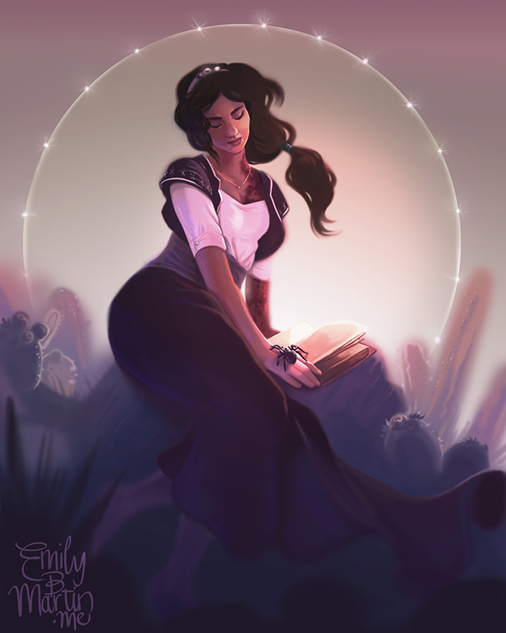
I decided to make 2018 about boosting my pieces from just “pretty picture” to “actual art,” focusing on elements that complemented and enhanced the image. In some cases, like the very Loish-esque character portraits above, I relied on the incorporation of whimsical details. In others, I explored dramatic lighting.
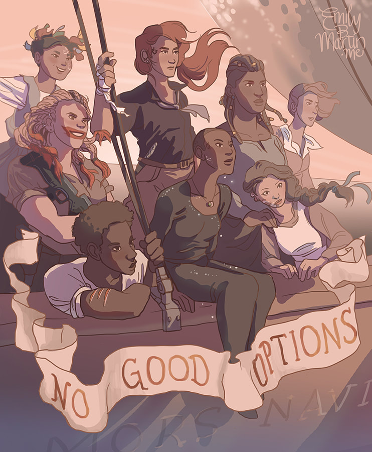
I played mix-and-match in 2018, leaping from one stylistic sandbox to another, pushing and pulling all the concepts I’d learned over the past few years to see how far they'd stretch. My work from 2018 is some of the most varied I’ve ever produced, but while in the past that might have suggested inconsistency, here it was a veritable playground of figuring out what the hell “Art” can actually mean.
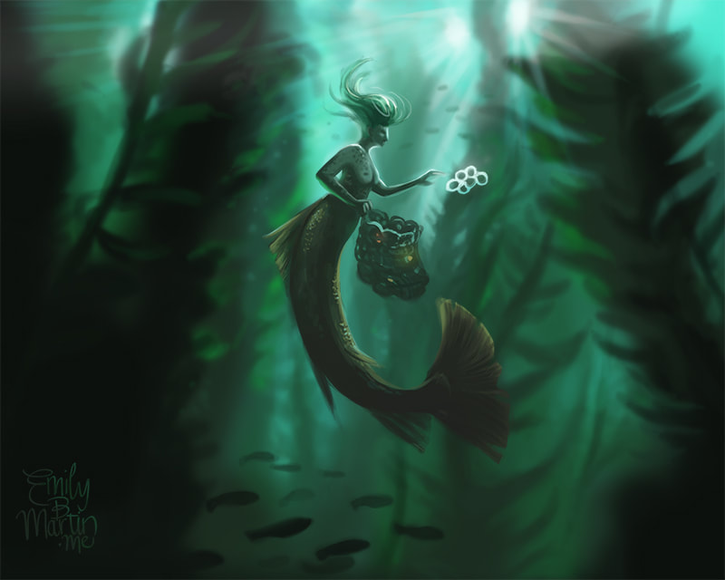
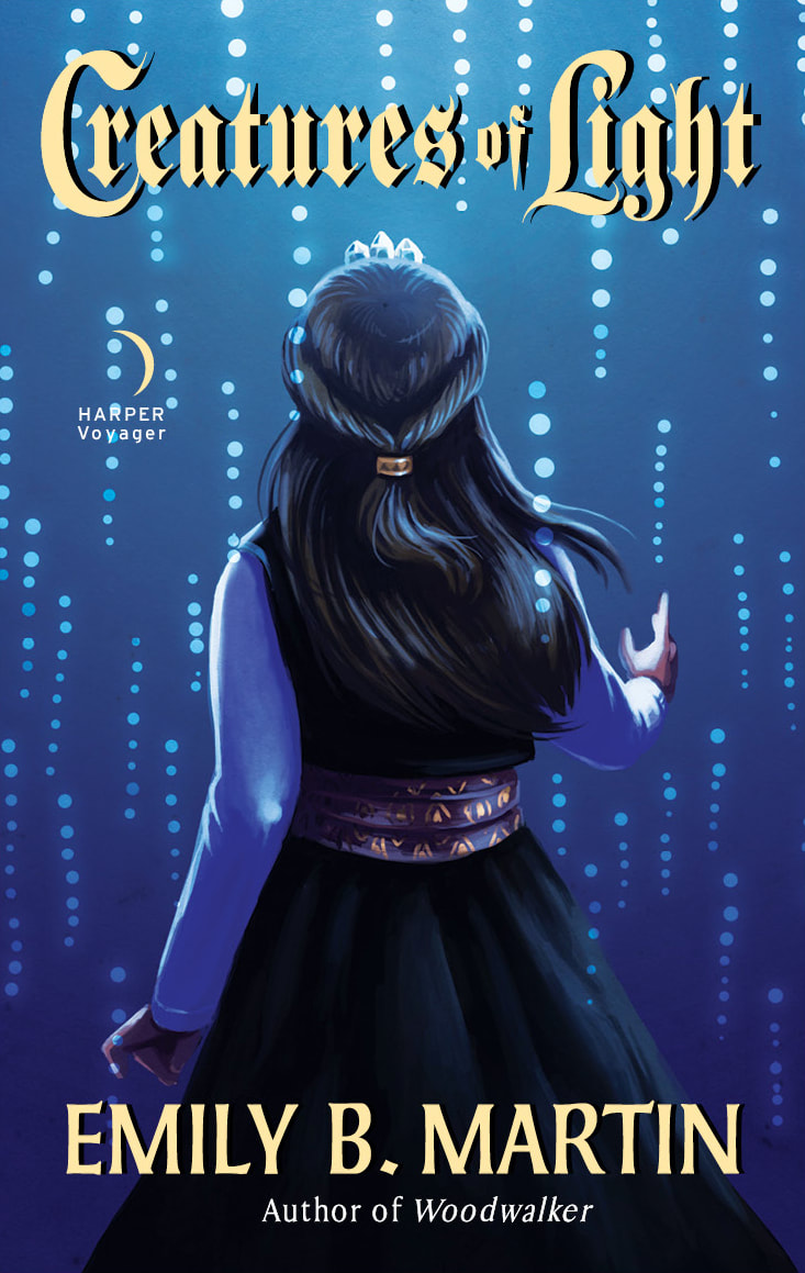
2018 was also the year that saw Creatures of Light published, the final installment in my trilogy. While I still did a lot of continued promotion for my series, my art started to draw more from other books and media. I produced a lot of fan art that year.
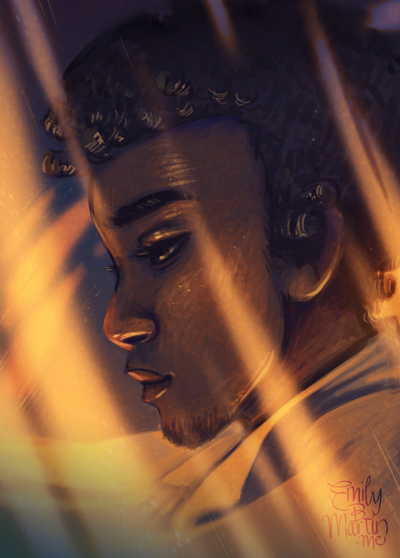
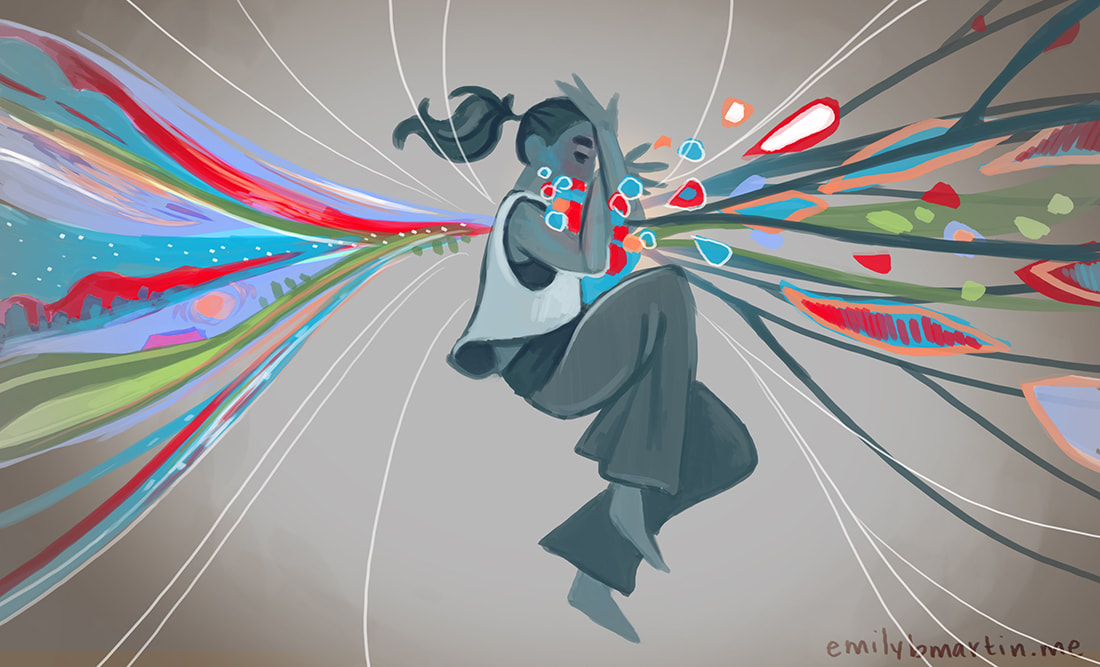
And so 2019 arrived… 2019: Purposeful Emotion…and fell flat on its face. In the first two months of this year, I’ve produced very little quality content. Some of that is for good reasons, like throwing down some record-high wordcounts on my current manuscript and working on a big, exciting project I can’t share yet. Some reasons have been less good, like my angst over the government shutdown and some personal struggles that have me feeling like I’m just spinning my wheels. But that’s okay. I’ve decided to make this year about being more purposeful in how I approach a piece, taking more time beforehand to envision, draft, and research it. Thanks to my years practicing foundation elements like depth, value, and color, I want to go a step further. I want to wring more emotion from my pieces. I want a viewer to look at a piece and feel it.
This kind of approach might not work for everyone. That’s fine! I enjoy prepping, planning, and setting objectives, but it might very well stress you or another artist out. If art is your way to relax, this might all seem like overkill. If you try setting these kinds of goals and it leeches the enjoyment out of your work, try something else! While struggle is the way we grow, I believe overall there should be joy and a sense of achievement in the process. There’s no right way to create art. This is simply a way that has helped me. What are some of your art goals for 2019? How are you going about achieving them? Let me know below! ResourcesBecause I didn’t have the benefit of taking art classes after high school, much of my progress has come from studying others online. Some of my favorite resources include: Loish’s Digital Art Group This is a great Facebook group for digital artists of all skill levels, moderated by the aforementioned Lois van Baarle. People post all kinds of work asking for feedback from other users, and despite having thousands of members in the group, all the interactions I’ve experienced are friendly and helpful, not nasty. One Fantastic Week Another Facebook group, based on a weekly web show for self-employed fantasy artists. It was recommended to me by artist and friend Justin Donaldson, who is himself offering some online tutorial courses. SenshiStock on Patreon I’ve been following SenshiStock for years and have done several pieces based off her excellent reference photoshoots. I like to collect interesting poses she posts and pull them out as warmup sketches. Griz and Norm on Instagram These two are feature animation artists at Disney and frequently post tips on everything from costume design to storyboarding, plus concept sketches and bonus material from your favorite Disney films. What I'm Reading:
0 Comments
Leave a Reply. |
Emily B. MartinAuthor and Illustrator 
Archives
August 2020
Categories
All
|
 RSS Feed

