|
MAY 2018
I've said it before and I'll say it again: fan art--and fan fiction--gets a bad rap, despite having this amazing power to build community, support other creators, and expand an artist or writer's skills. It took me a long time to stop feeling embarrassed about creating fan art and -fiction--now I can look back and see all the strides I've made because I was inspired by my favorite books or movies to draw and write, and I can safely say I wouldn't be at the same place, technically or stylistically, without sketchbooks and Word documents full of fan-fueled creations.
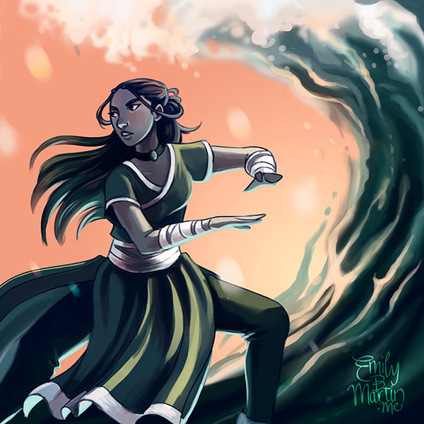
It's timely, then, that I'll be giving two presentations this summer on the power and value of fan art! I'll be sharing some work that has made a difference in my career and doing a live-drawing demonstration of a popular character the audience will help me pick (for more info, see my Events page). To get ready for these programs, I asked my Facebook and Twitter followers to vote on a character I should draw for my May blog post. Out of a poll of four cool young women, Katara beat out Hermione, Eowyn, and Moana! I got into Avatar: The Last Airbender in undergrad, which at the time felt way too old to be watching a kid's anime, but now I love referencing it as an example of masterful storytelling, worldbuilding, and character arcs. And I hadn't drawn Katara in so long! So here she is---check out her progress video and art tutorial below the jump!
Lately I've been playing with getting more stylistic with my pieces, pushing my color palettes and strengthening my forms and composition. So I wanted to try something a little different than Katara's typical blue palette. Not shown in the video are the thumbnails I referenced from tai chi photos online or the handful of rough sketches I made and discarded before I settled on this pose (largely because I forgot I was supposed to be recording).
The main steps for this piece are similar to the ones in Celeno's progress video from February. After laying down a rough sketch I was happy with, I followed this basic process: 1. Base colors- Slapping down really fast color just to get a sense of my palette. As you can see from the video, these changed pretty dramatically as things went on. 2. Line art- Reducing the opacity of the sketch layer, creating a new layer on top, and using a small pastel brush (see my Brushes image below) to refine the line work. 3. Adjusting colors- Altering the background and creating a distinct color layer for Katara in a contrasting value. 4. Basic highlights/shadows- Throwing down some brights--a dramatic tint along Katara's right side and a more subtle bounce light underneath her left side, and adding a purplish shadow through her interior. I put each of these shades on a different layer, masked to the flat color layer underneath and set to either Color Dodge or Multiply, so I could adjust them. 5. Refining- I duplicated and then merged all of Katara's layers, created a new one on top, and started blending colors and defining details, while keeping some roughness for energy. 6. Background- Adjusting colors/refining background shapes. For water, I like using a big soft brush for swaths of color juxtaposed with crisp edges. For some of the bubbles, I used a brush I created to draw freckles--it's basically just a hard round brush with Scatter and Opacity Jitter adjustments. You can see these bubbles in the video, but I took most of them out after the fact and tweaked the water a little more, so they didn't actually end up in the final image. 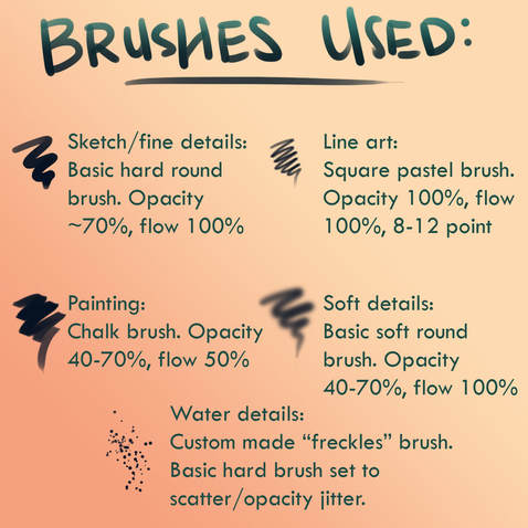
Finally, I flattened the image and used my color balancer to do some final color adjustments, and added my signature (another custom brush I use on all my pieces).

*^*Water Tribe!*^*
If the universe is on my side, this piece may also have the distinction of being my very last one on my Wacom Intuos tablet! I've been creating digital art for thirteen years now, and throughout that time I've only ever used external tablets that plug into my laptop and sit off to the side; I started on a Wacom Graphire in high school before graduating to the Intuos after college. My Intuos still has life in it (so does my Graphire, actually--it's hard to beat Wacom quality tablets), but lately I've started to feel the limitations of working within a 7-inch rectangle that's not even in front of my eyes. I'm not able to achieve the control I need over my lines, and too much time is spent undoing and redrawing marks that aren't quite in the right place, or at the right curve. I've gotten so used to using my hotkeys to fix these kinds of mistakes that they've just become a seamless part of my process, but I'm at the point where it's slowing down my work and limiting what I can produce.
But shhh, don't tell it that.
So last week I did something I've been planning and budgeting for a while--I ordered a Wacom Cintiq, which is essentially a large free-standing monitor that you draw on directly. For the first time, I'll have my work under my hand, and sixteen whole inches of space to move and rotate and zoom.
It does feel a bit like a divorce, but I expect I'll still use my Intuos for remote work, and for the fan art programs this summer. Just... don't tell my Intuos until it's absolutely necessary, okay? It's like the grown-up version of Toy Story. I don't want it to get jealous or depressed and throw the Cintiq out the window. I don't think I can claim equipment sabotage on my taxes. May Art Roundup
A few mermaids for Mermay, a portrait of a new protagonist, and some Musketeers fan art. All the mermaid pictures are available as prints in my INPRNT shop!
0 Comments
Leave a Reply. |
Emily B. MartinAuthor and Illustrator 
Archives
August 2020
Categories
All
|
 RSS Feed

