 En plein air is just a fancy French way of saying painting outside. I never really considered myself capable of plein air painting until my first season as a ranger in Yellowstone in 2015. While in the park, I had the opportunity to learn from Suzie Garner, a fantastic watercolorist and plein air painter. She opened the door to landscape painting for me and gave me so much confidence! Now watercolors are some of my favorite ways to document my trips and ranger seasons. Now that I’m back in Yellowstone, I’ll be doing a lot more plein air work this summer, so I thought I’d break down my materials and process for anyone who might be interested. I spent the morning painting the Teton range, so check out the progression below the jump! Let’s start with material! I use a Winsor & Newton travel watercolor set, though I’ve replaced some of the colors with Cotmans as they’ve run out. Brand isn’t terribly important—what’s more important is a palette that is easy for you to hold while sitting or standing in outdoor locations. I use the standard brush it comes with, along with my trusty Micron pens, opaque white gel pen, and ordinary mechanical pencils. I can’t even recall what brand my sketchbook is, but the sticker was designed by Suzie, my plein air teacher. I also always have water and napkins on hand—more on that later. 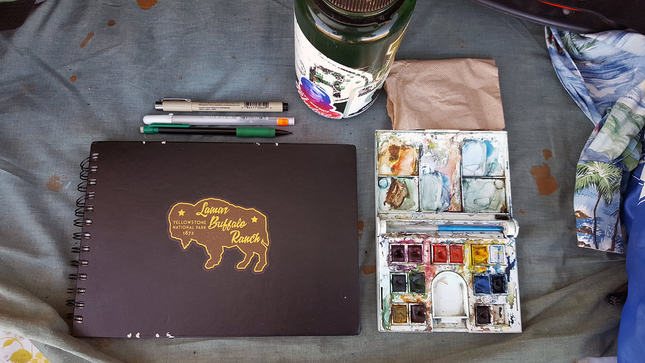 The first big decision, of course, is what to paint. This morning, driving my grocery route from Grant Village in Yellowstone to Jackson, WY, it wasn’t a terribly hard decision to make. The skies were a classic western blue, and the snow-capped Teton group shone in the sun. I pulled off at one of the roadside pullouts, opened the hatchback, and settled in to capture them. 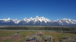 As a ranger, I do feel obligated to note--if you're painting outside, exercise the same caution and common sense you'd use if taking a photo. Never travel in areas you're not supposed to travel, and pay attention to whether you're impacting the environment with your setup. Don't bend rules just to get that great vantage point--your safety and the health of the environment is more important. Now, back to painting. Sometimes I launch right in to a painting without laying down linework first, particularly if I’m in a rush. Yesterday, I hiked to Imperial Geyser with another ranger, and despite his reassurances, I didn’t want to delay us too long—so I started right in with paint. Besides that, you may find some features, like hot springs, don’t really need linework to shine. 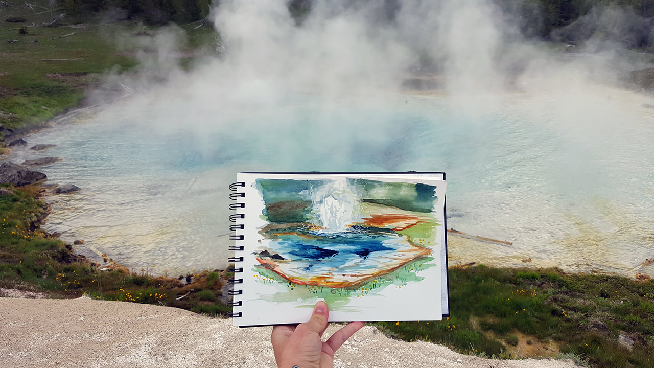 But I wanted to spend more leisurely time with the Tetons, so I went ahead and laid down a quick pencil sketch, focusing on overall shape. One helpful trick Suzie taught me was to add a “W” where I meant to leave white space—it can be easy to accidentally paint over a white space in the thick of the moment. 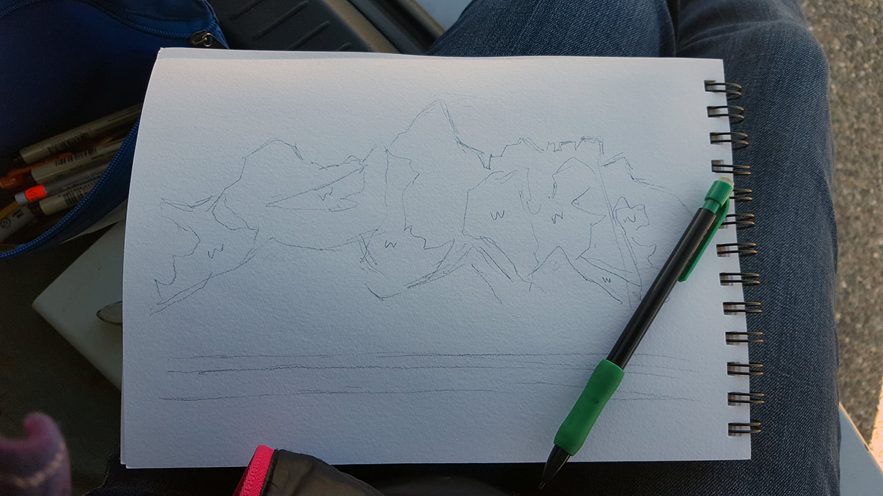 After getting the pencil roughs down, I started in with my Micron pen, arbitrarily a .03 thickness. I made the mountaintops a solid line, but I made the foliage below more broken—another tip from Suzie to suggest texture. 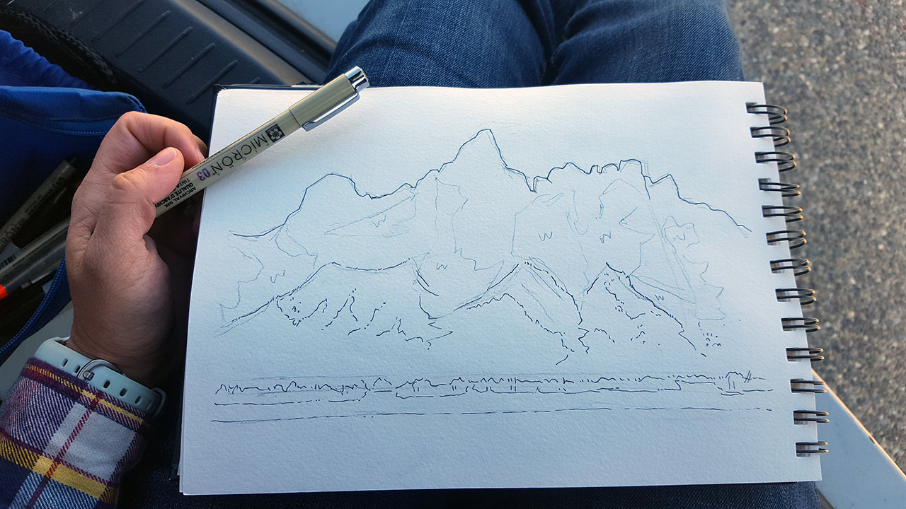 I erased my pencil marks—but not the Ws… 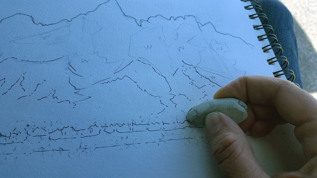 And started in with paint. I like to start with skies, because I won’t drag my hand through my painting trying to wash them in later. I often put down a really wet base and let the colors bleed. With a bright blue sky like today, I made the upper reaches darker and let it fade as it approached the mountains. I loved the little wisp of cloud that kept clinging to the Grand, so I blocked that in by leaving a dry patch in the wash. 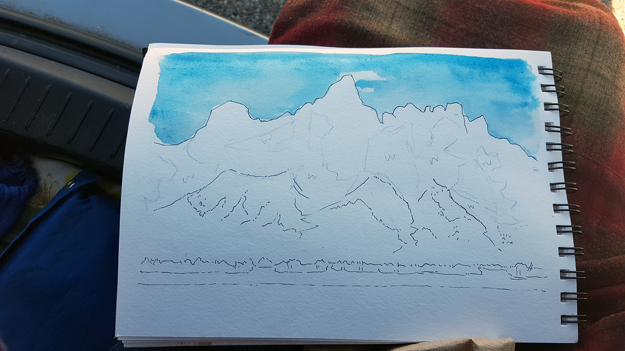 Next, I washed in the sage flats below to let the sky dry a little, and then laid down some light browns and grays on the mountains. One thing I had to get used to with watercolors was working from light to dark—in digital work, I often start with my dark values and build up to light. But watercolors are meant to be layered on, and while it’s easy to make something darker, it’s harder to make something lighter (though it is possible—just flood an area with water and blot with your napkin. This can muck up your paper if done too much, though, and doesn’t created as light a color. It is a handy technique for adding geyser steam, I’ve found.). 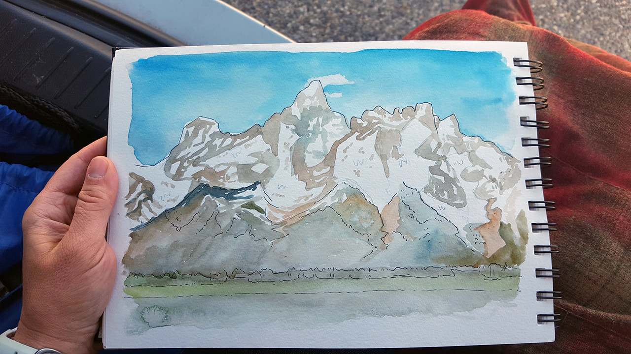 After getting these base colors down, I started to layer in some shadows and the darker forests on the slopes. I made a point to try to keep an eye on overall form, rather than getting too tied to minutiae. A helpful thing Suzie stressed was paying attention to edges, such as the line of trees at the base of the mountains—if these are vague, it can make your painting flat and hard to read. Delineating edges can create depth and make things more recognizable. 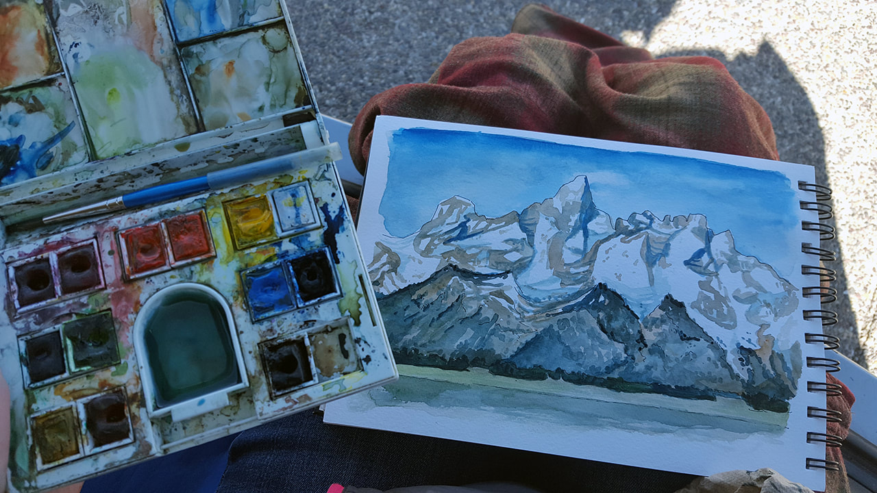 Once I was happy with that, it was time to put my paints away. This may seem like it’s not worth mentioning, but Suzie stressed to us that since we were painting in national parks, we had to be aware of the impact we could potentially leave behind. Never take water from a natural source, she said, and never dump your paint water on the ground or in a stream. Practice Leave No Trace principles, just as if your dirty water was trash. She always carried a small water bottle for this purpose. Since I often forget a bottle just for paint, I’ll use my napkin to soak up the remaining water in my well, and then throw it away at the next opportunity. 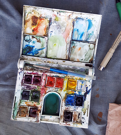 I wasn’t quite done, though. One of my favorite things about painting in public lands is that there’s often a visitor center nearby, and those visitor centers often have stamps or stickers. Whenever possible, I love putting the national park stamp on my pieces—not only does it date the piece, but it creates a scrapbook timeline of my trip. So I set my wet paints and painting carefully the back seat of my car and drove a little way to the Moose Junction visitor center to find the stamp. 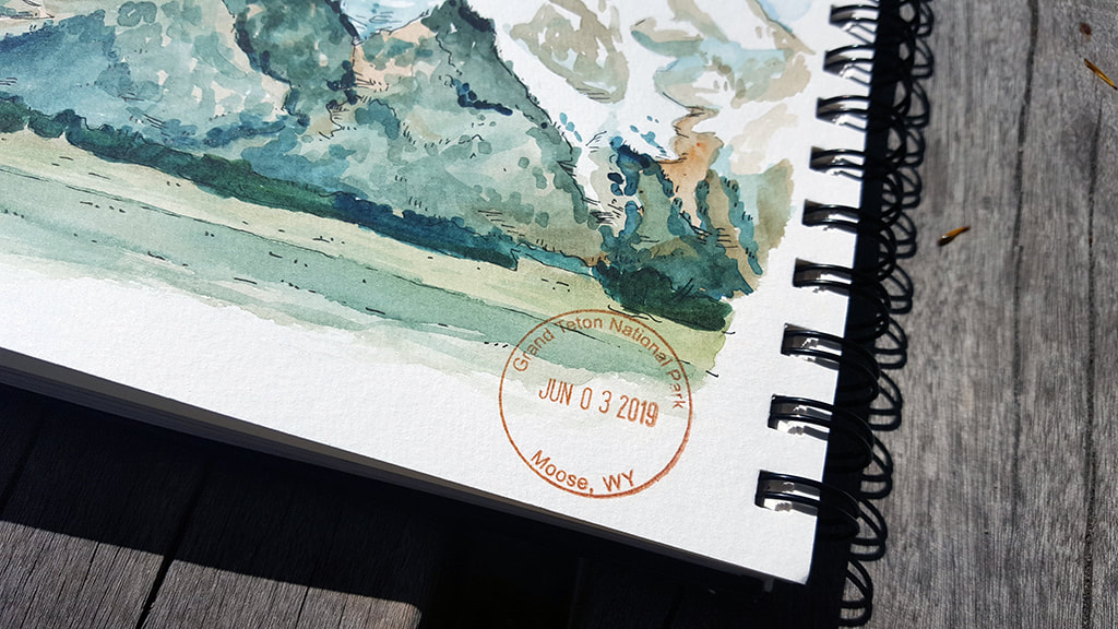 So there it is! That’s my process for plein air watercolors. 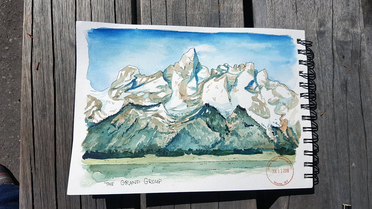 This piece in particular took about an hour, while the one of Imperial Geyser took about half that time. I'm so glad I took the plunge and tried my hand at plein air watercolors, despite not thinking I was a "serious" enough artist to work with them. I love paging back through my sketchbook and remembering the cool mornings and quiet spaces and conversations I’ve had while painting. Watercolors have forced me to pay more attention to form, and taught me to embrace serendipity. Be sure to watch my Instagram feed for all my plein air work throughout the summer! May Art Round-UpA lot of plein air work, some digital pieces to celebrate the finishing of my edits on The Outlaw Road, and a handful of commissions to help make ends meet during a paperwork hangup at the start of the season.
0 Comments
Leave a Reply. |
Emily B. MartinAuthor and Illustrator 
Archives
August 2020
Categories
All
|
 RSS Feed

